Babolat Pop sensor
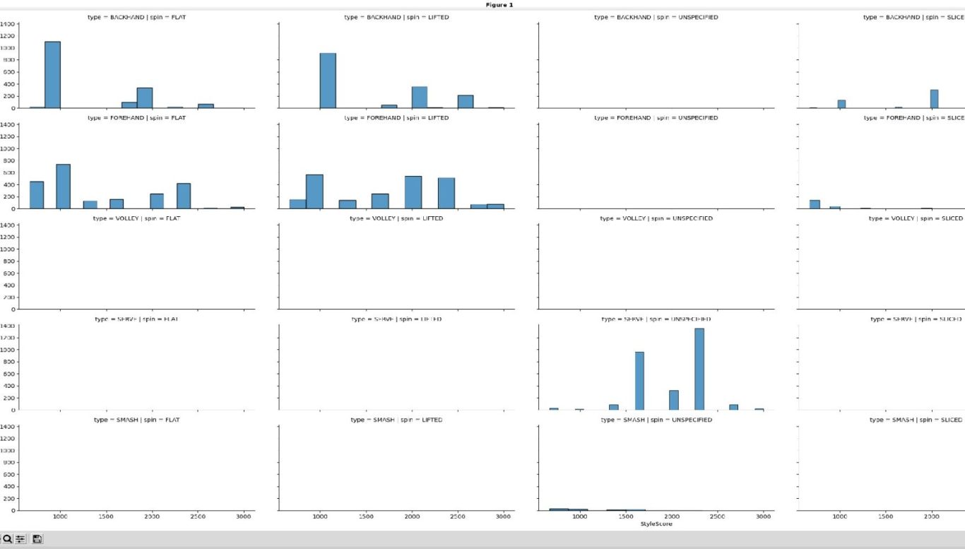
The Babolat Pop sensor is discontinued. It's a wristband that is worn on the racquet hand. Previously, the company contracted with another company to produce a PIQ score. This combines 3 values: speed, style and spin against a pro player as reference. The pro player is referenced to 10000, and would be the maximum achievable score. With that said, this part of the sensor is discontinued. I'm not sure if I can log out, but I'm not going to chance it. Since it is discontinued, it's definitely not a good idea to get one. This data seems incomplete as well, but there also might be some signal there.
Another dashboard for BabPop data. Since this was a dashboard template, I don't think it means anything though.
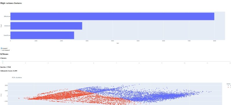
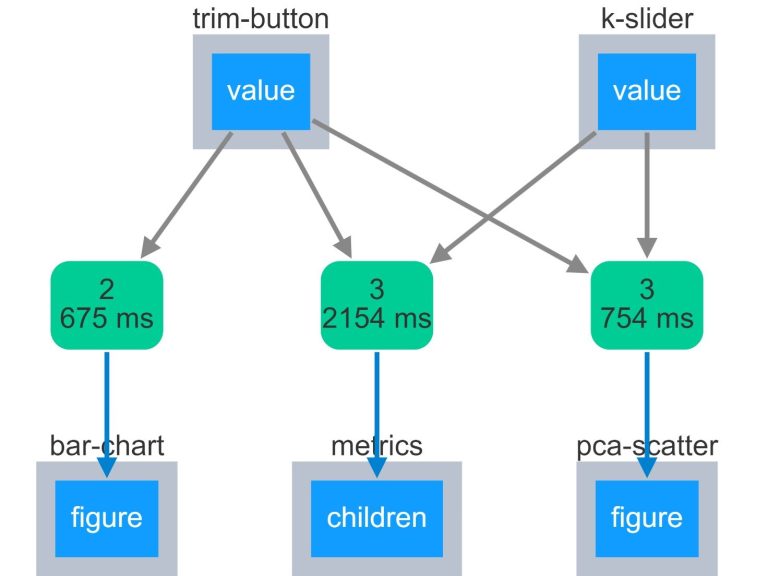
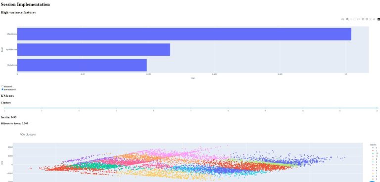
Unanalyzable?
Not necessarily! Maybe using a template wasn't the right choice. There may be some other ways of looking at this...
Babolat Pop sensor data
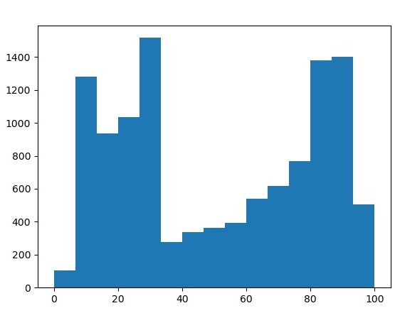
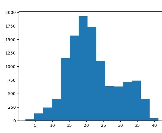
Let's think about the data again. Remember, there are three different categories that each shot is measured on, effect, style and speed. Each category has an absolute value and then is normalized to 3333. The "perfect shot" would have a PIQ of 9999, which is just a summation of the three categories. The style category is an integer value, ranging from 2 to 9. Speed ranges between 0 and 40 and effect from 0 to 100. As
Here are two histograms of all three values on the same graph.
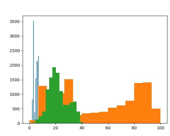
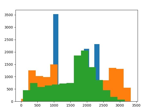
The effect value distribution is very strange! The speed value histogram is less so... One other observation is that the speed score and speed value columns have slightly different distributions.
Here is a pairs plot for all of the factors.
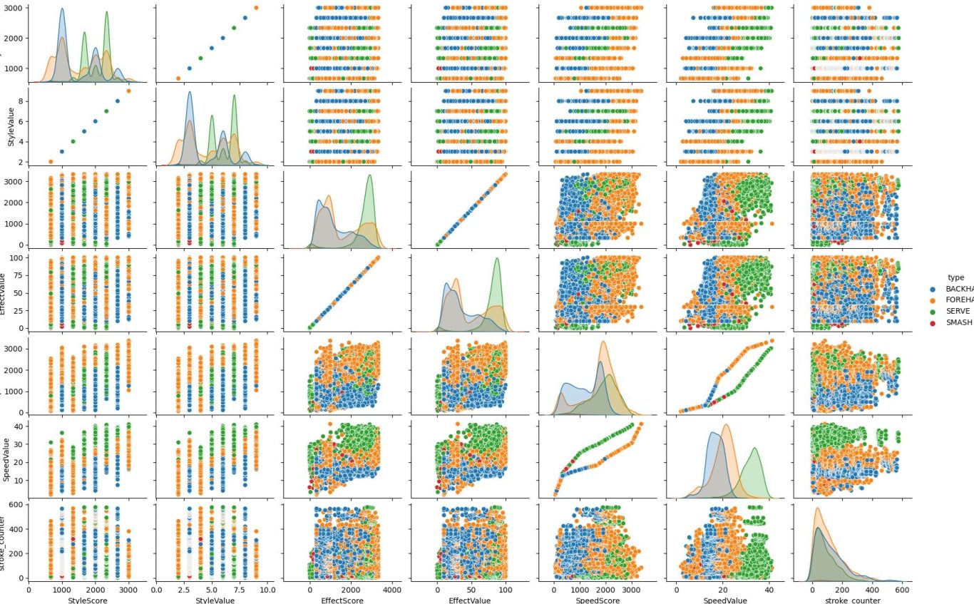
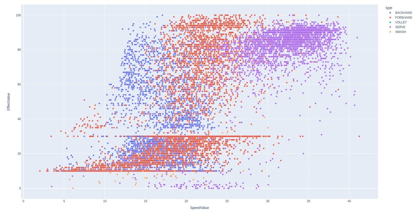
This provides some answers. First, look at the speed value vs speed score. This isn't a simple linear relationship as we see in style value vs. score, which are multiples of each other. This is probably why the histograms have slightly different shapes. One other chart that is quite interesting is effect value vs speed value. If you look closely, you can even see some striations. Let's look at this graph more closely...
What does it mean?
It's pretty hard to say. There are three major colors, purple blue and red.
The purple is a clearly distinct population. The serve is hit both hard and with spin, so this is why it's a clearly distinct population. Red is forehand, which is a more powerful stroke than the backhand, so this is also reflected here. What is less clear to me is that there appears to be a subpopulation for lower effect scores.
There is also significant banding at effect value of 15 and 25. I am unsure of why this is. Finally, the only places where smashes are visible in the data is for effect values lower than 15. More information would be required for more analysis.
More analysis
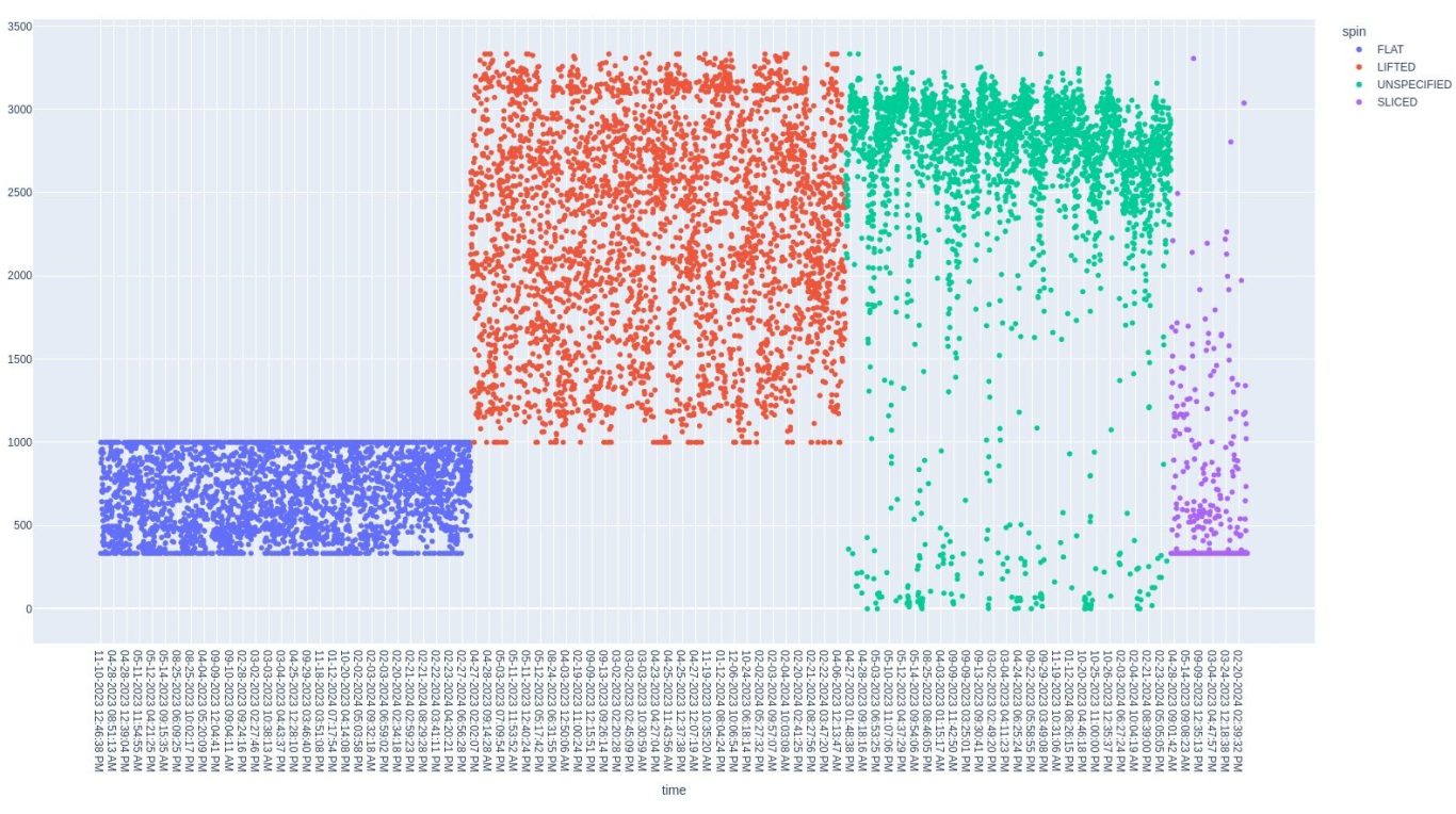
Let's look at another graph. This is EffectScore vs time scatter plot, separated by spin type. The serve and unspecified shots appear to match up But, the source of the banding is now clear. Flat shot and lifed shots are exclusive from each other. Flat shots have upper and lower bounds while lifted shots (topspin) and sliced shots have lower bounds. These bounds explain both the striation and unusual distribution.
SpeedScore vs. SpeedValue
As discussed earlier, this is an unusual graph, so it should be looked at more closely.
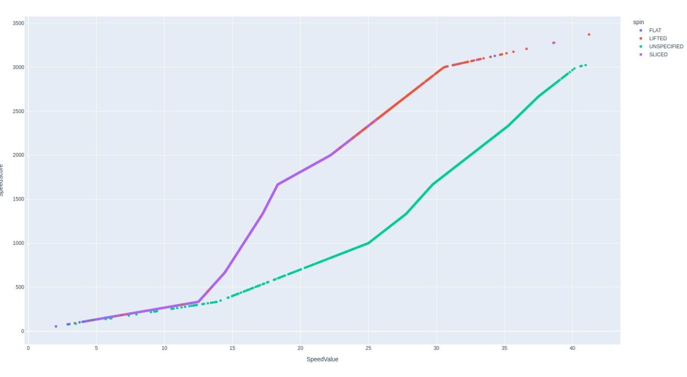
This indicates that there is a different multiplier starting at ~12.5 spin value. for serve compared to all other shots. It's hard to know why though.
PIQ vs. time
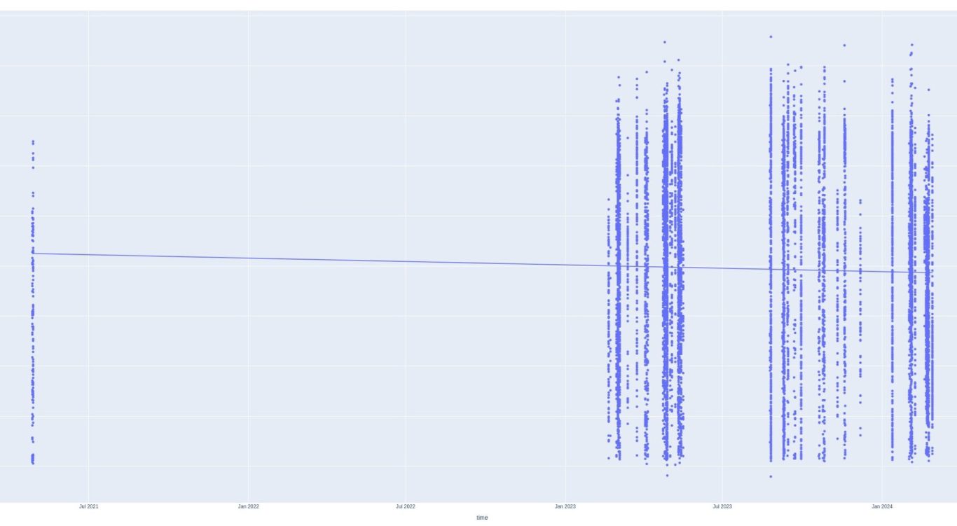
This is a scatterplot of PIQ vs time. Striations indicate all PIQ sessions within a short time. There seems to be a very long gap between 2021 and 2023. Perhaps it would be better to take a PIQ average of each day and then forward fill any gaps with the previous average?
Let's add to this in another analysis!
Forward Filled Daily Mean PIQ
Have I already made my five times fast joke?
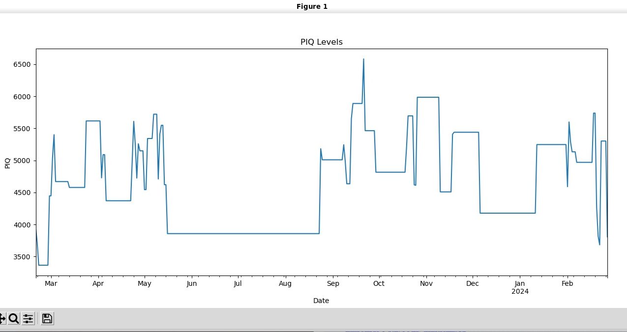
Well, maybe we have something here? This does seem to be a lot more interpretable, but also does seem spiky...
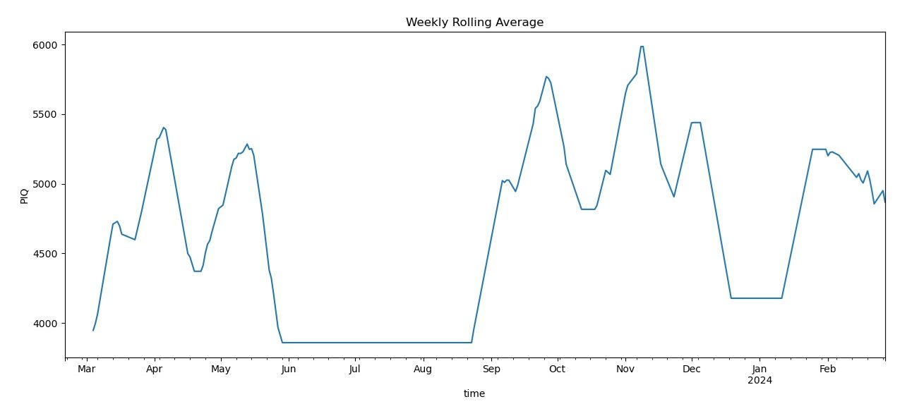
This seems better and shows that there is some seasonality to the player's form. Perhaps this is something like autocorrelation?
That would mean that the last session could predict the next session. Let's check further...
Rolling 14 day average
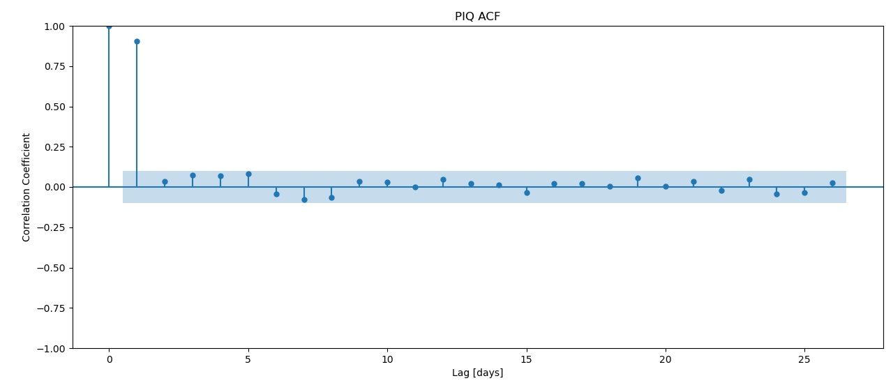
Autocorrelation (ACF)
This shows how much signal there from the last few days of lag. From this graph it seems that the last 16 days of so have reasonable amounts of signal. However, a possible consequence of using so many days of signal is that there might be overfitting. Perhaps PACF is a better approach?
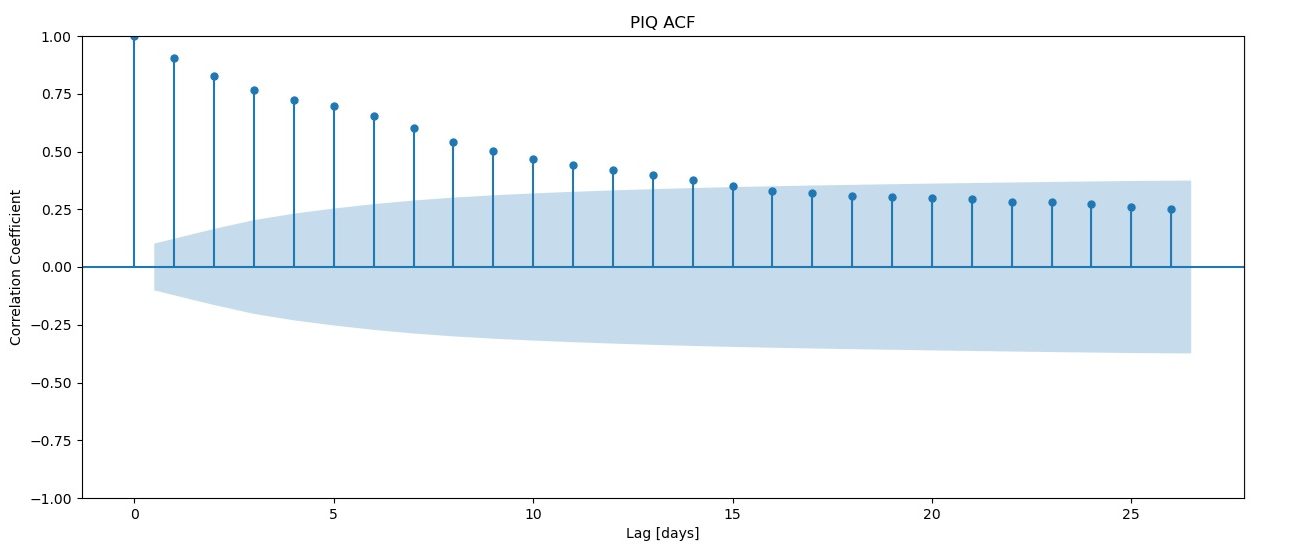
This indicates that the signal is strongest just a few days before, then fades quickly. But, which model approach is better? For that, we're going to have to do some testing.
PACF - Partial Autocorrelation
Training the model
We have some data. Let's split it up into training and test data. We'll use 80% of the data to train and the rest to test. We also need a baseline model. Let's take the average PIQ reading and make that our baseline.
Use AR (Auto Regressive) model
y_train shape: (299,)
y_test shape: (75,)
Mean PIQ Reading: 4614.043750690786
Baseline MAE: 639.3475929683959
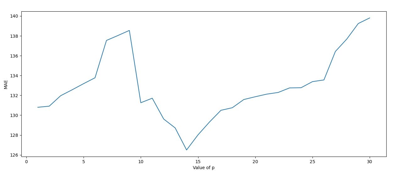
Using the AR model, we calculate the MSE of p 1 through 31. It's clear that p=14 days is the best p value to choose.
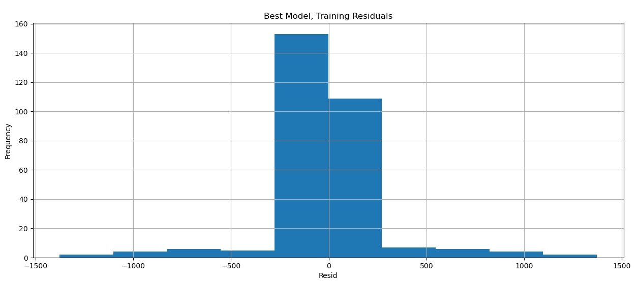
Residuals of our best model (p=14)
Residuals are how wrong our model is. Hopefully, the model is relatively accurate and not heavily biased in either direction. These factors will be expected to give a nice, tight normal distribution, as we see here. It appears that our best model has some merit.
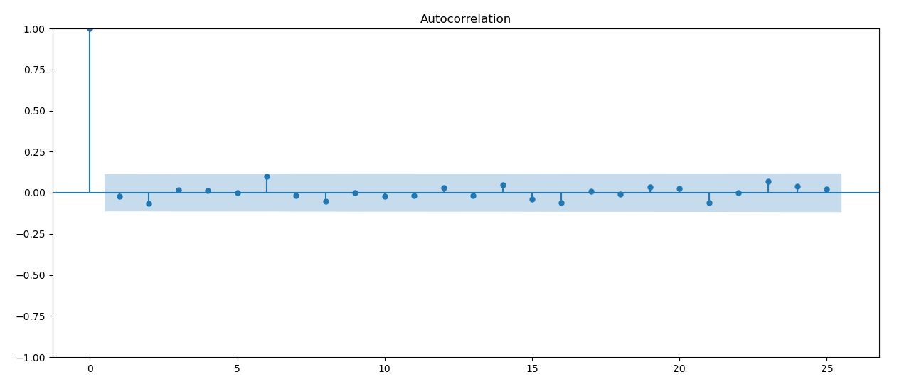
Autocorrelation (ACF) of residuals
Residuals can be checked for autocorrelation. This doesn't seem to be the case here, though.
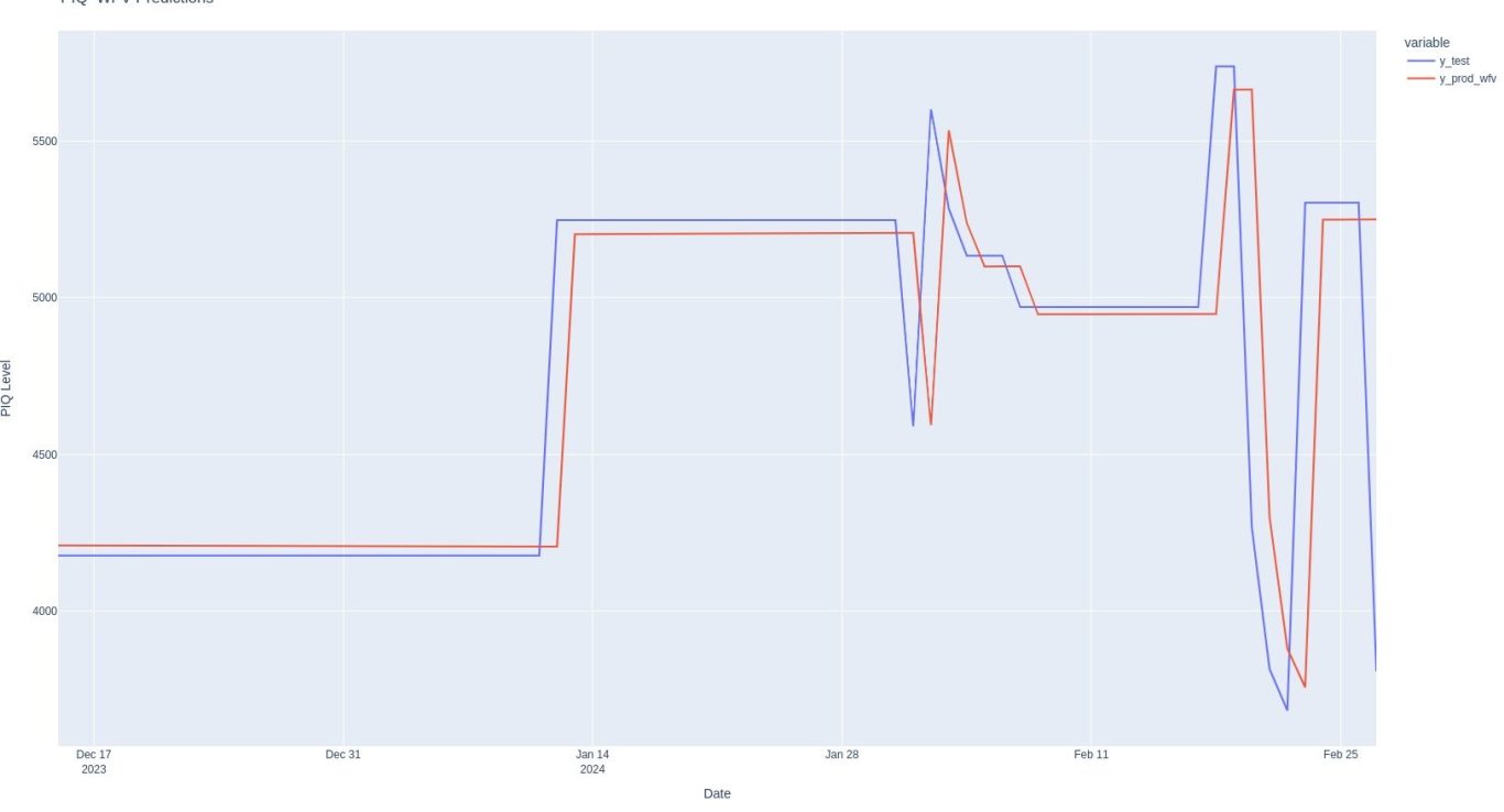
Not bad! It looks like there might be some validity to this approach. The pred function in red does a reasonable job of predicting our test set in blue.
Communicate Results
Let's see how our predictions compare to our test set.
Conclusion
We've come quite a ways in this analysis! What started with a choatic seeming data set and put it into a template analysis that didn't help things. But, thinking about what we knew about the data set allowed us to focus on PIQ score (which is a combination of effect, speed and style) and construct a time series object which we forward filled.
We saw that averaging PIQ score by day gave a nice signal, and then using a 14 day moving average made the curve look smother.
We also found the 14 days was the best fit for our prediction model (this is likely a coincidence) and provided a strong improvement over our baseline average prediction.
Code?
Not available. Although I wrote this code, the approach is heavily based on the approach taught at the Applied Data Lab at WorldQuant University so I am not comfortable sharing the code.
Please apply to the program if you're interested!! It's totally free and can be completed in about 16 weeks!!
So that's it? Data set analyzed?
Not by a long shot. This is a complex data set that would be hard to fully analyze. There are a lot of further approaches we could look into. Perhaps it would be better to zoom into one day in particular.
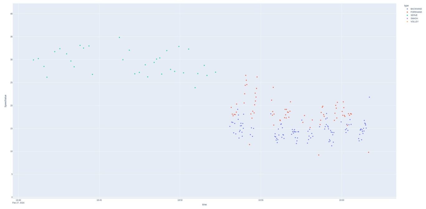
Not exactly east to see, but this is speed zoomed in. The shots occur over a 20 minute interval. The first 10 minutes appear to be serves, and then the rest of the time a farly even distribution of forehands and backhands. Speed has a very clear distinction between serves and other shots as the minimum speed is greater than the maximum forehand speed. Style and effect do not show this clear type of separation. This appears to be a practice session, with serves first, then groundstrokes 2nd. Let's zoom in and take a look at what appears to be a match:
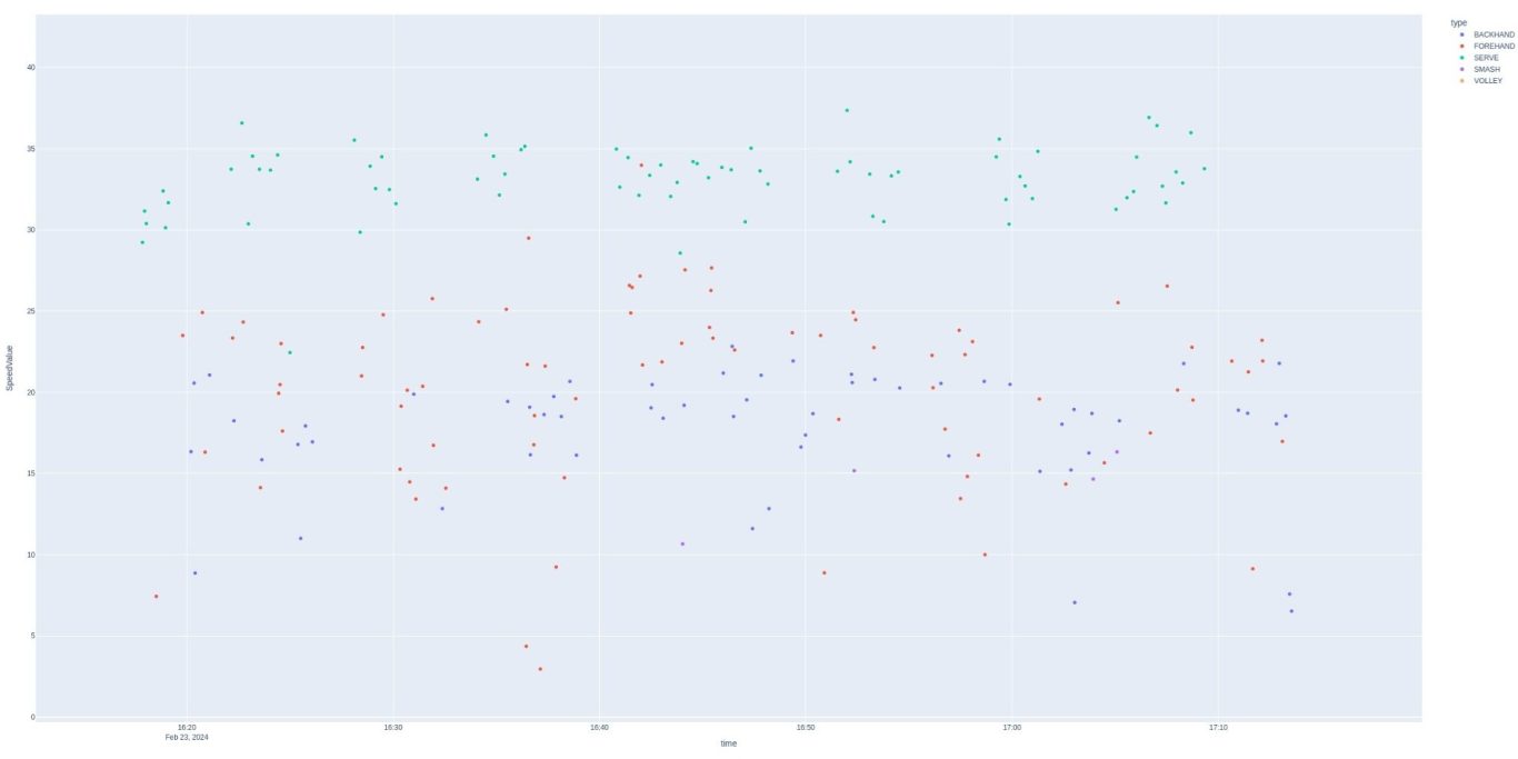
This tracks more closely with what one would see in a match. Serves still stand out in value, but not in shot order. The Babolat app decodes the values further and provides a maximum and minimum speed for each shot (MPH)
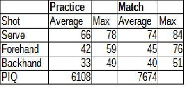
It seems like we could proceed further using these data points. Do you have any ideas?
We need your consent to load the translations
We use a third-party service to translate the website content that may collect data about your activity. Please review the details in the privacy policy and accept the service to view the translations.