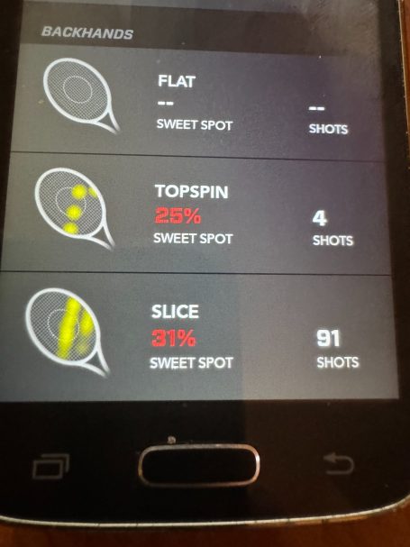
Zepp Universal sensor - Tennis
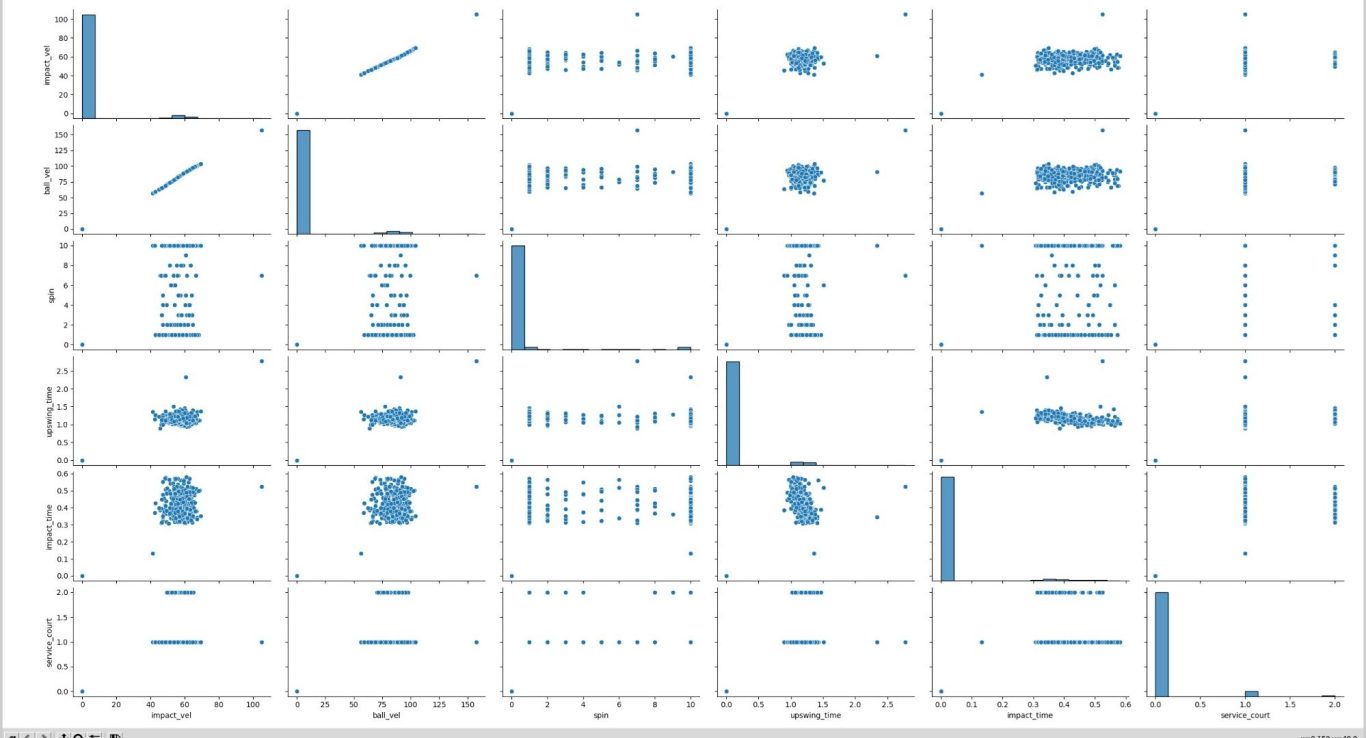
Pairs plot - serve
As previously discussed, the Zepp Universal Sensor has several modes. Let's look at the tennis mode now...
Let's once again consider a tennis shot. We have a force in the x-direction (speed) , a force in the y direction (spin ) and a more difficult quantity to rate, sweet spot contact.
The Zepp data is structured differently because it is unsupervised. Previously, in our golf and tennis data, we've had overall scores like PIQ. These would quantify the input data, or feature set. This is not the case with this data, so we'll have to proceed a little differently. In addition, there are two data sets, serves and session.
Pairs plot - session
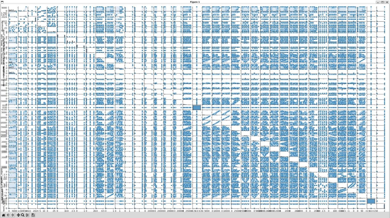
Well, the serve data is certainly a lot less complicated!! But, we are more interested in all shots, not just serves, so let's plow ahead here. Perhaps we can try the ridge regression approach again?
Another ridge regression?
Maybe, but we don't have a target this time... We're going to have to find another way to think about our data. Perhaps we could cluster it? This means looking for similar groups in the data.
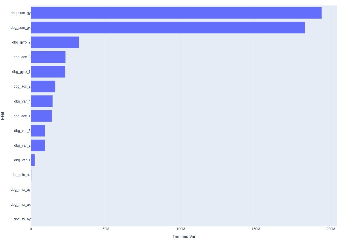
Looking at our column names gives us some further clues. There seem to be two different type of columns. Some appear to be sensor outputs, while other seem to be calculated from these sensor outputs. Let's try separating them and first focusing on signals that appear to be sensor outputs. here are the variances of the top features....
Let's make a k-means model and iterate it to find the best amount of clusters!!
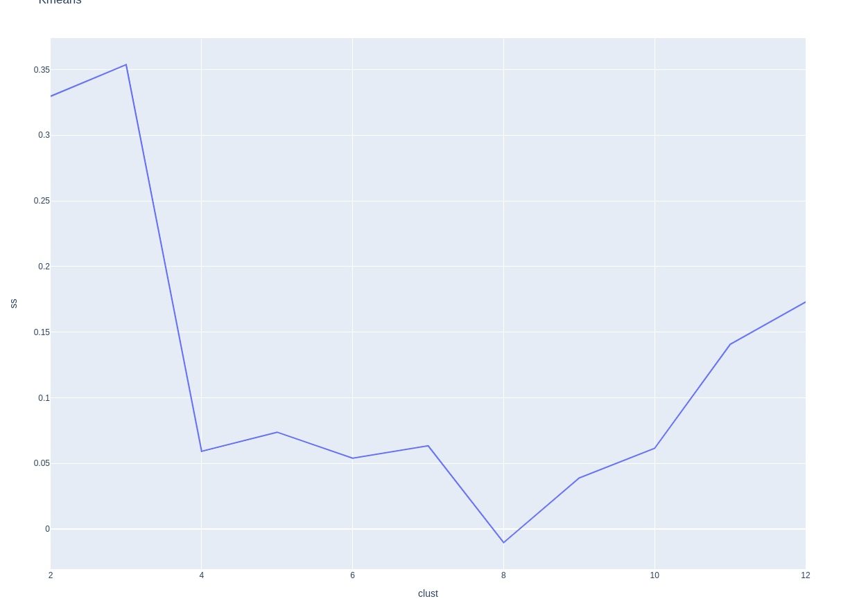
Running through different k values makes it clear that 4 groups is the optimal choice. Any more doesn't help performance and then starts hurting it. Remember, choose the simplest model that explains the facts... 4 groups does match what could be different spins.
Here are the means by cluster:
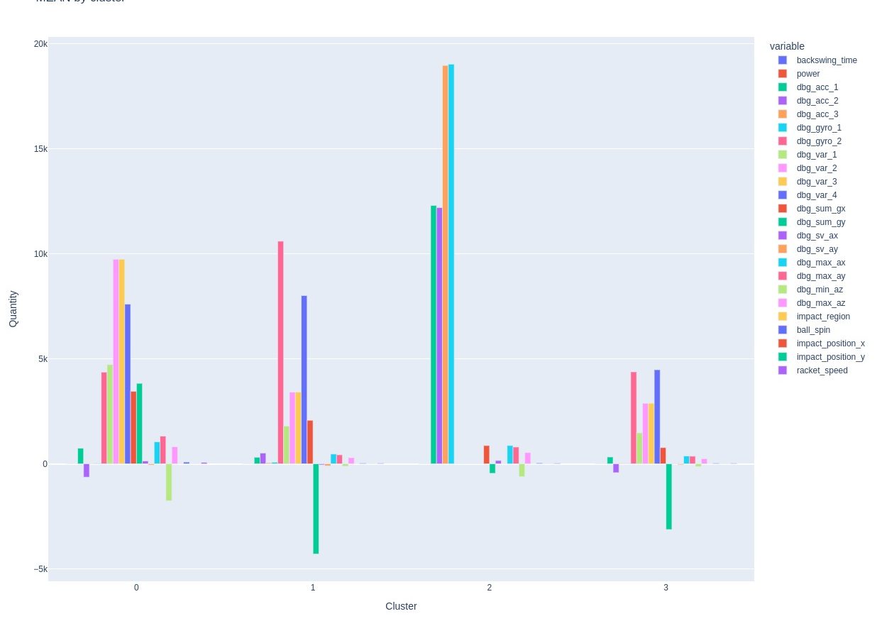
It's hard to know what to make of this. Let's try PCA (Principal Component Analysis). PCA creates combinations of existing vectors and then removes everything else from the model, leaving a simpler model that may have lower variance.
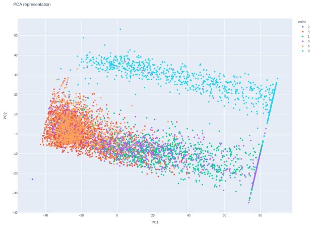
Here is the PCA cluster chart.
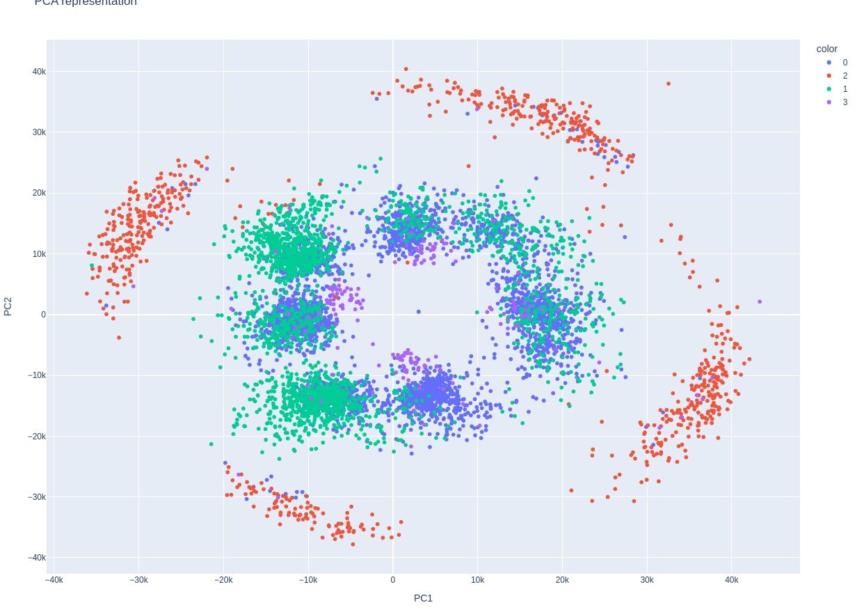
This is an extremely interesting chart. It's impossible to miss how much it resembles a tennis racquet and also sweet spot contact. I don't know what this means though. It's possible that there is some leakage, but this should only be from the sensor data. Leakage would mean that a signal is sneaking through that has already been calculated, such as x - y position. This is only supposed to be raw sensor data
PCA Update!
There has been a veritable stampede for more information about the PCA.
I hear you!
We've got to proceed!!
Calculated values
Variance plot - ball spin most significant
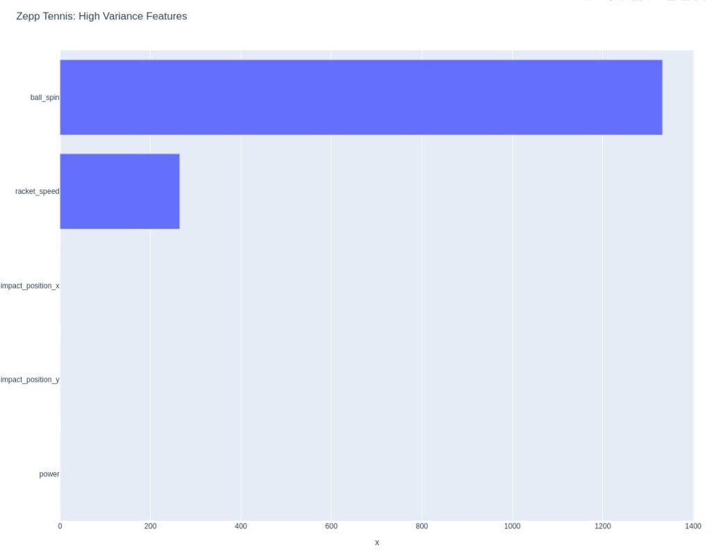
Let's proceed with what we assume is the calculated columns. This is power, ball spin, racket_speed and x,y impact position. It is my opinion that these values are calculated from sensor values. There was an easy separation to make in the data, as all the sensor signals seemed to be labeled with dbg, which is probably short for debug.
Let's follow the same analysis steps as before...
This is a little less clear. Looks like 3 clusters is a good choice, but maybe also 6? Lett's try both...
Silhouette score - how many clusters?
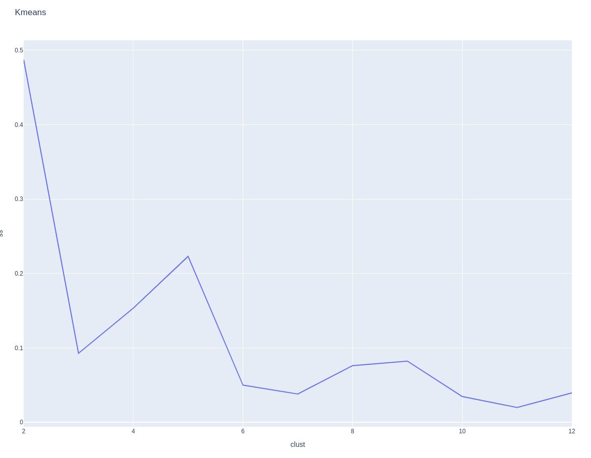
What have we learned?
This doesn't seems to be as useful as what we saw from the raw sensor data. It's hard to know what to make of it. The only possible thing that I can see is that maybe we can see some form of sweet spot contact on the left. Since the data is transformed, it isn't straightforward to interpret, I think.
It's hard to say. To begin with, since this is unsupervised data, we are dealing with a different situation. The PCA of the raw sensor signals was impressive in that it seemed to form a racquet pattern. But, we need to be careful drawing any conclusions.
Next steps?
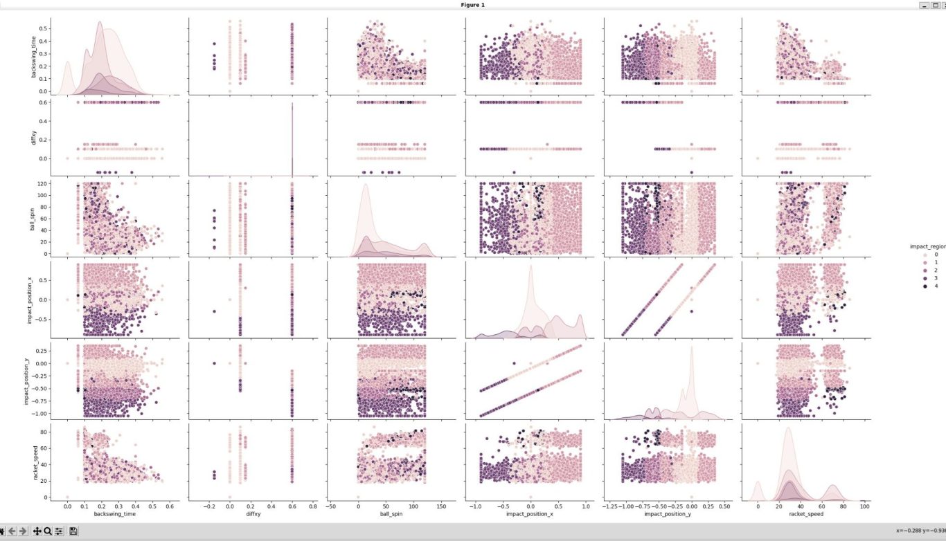
Maybe we could look at the pairplots again? Here's the calculated values pairplot. Once again, we see very many interesting patterns. I think most interesting is that impact_x and impact_y have some double linear relationship. y is just 0.5*x -.1 or -.5. There are also 3 outliers at y=0 which are clear false readings. The range of y is -1.05 < y < 0.35. The range of x is -0.9 < x < 0.9
Power and racket speed have and almost perfect linear relationship, so only one of the two needs to be included for any further analysis. Power is normalized to 1, while racket speed has a linear range similar to ball_spin with a maximum around 85.
Lastly, impact region and impactx are clearly related as we can see distinct groups best on this graph.
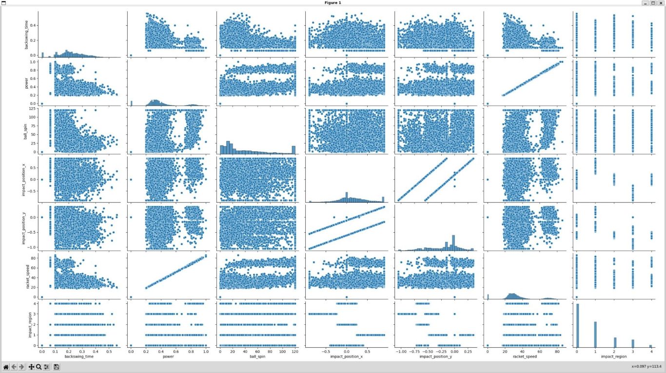
Let's take a closer look at some of these interesting graphs. Let's try to understand impact region first, since it has five clear categories
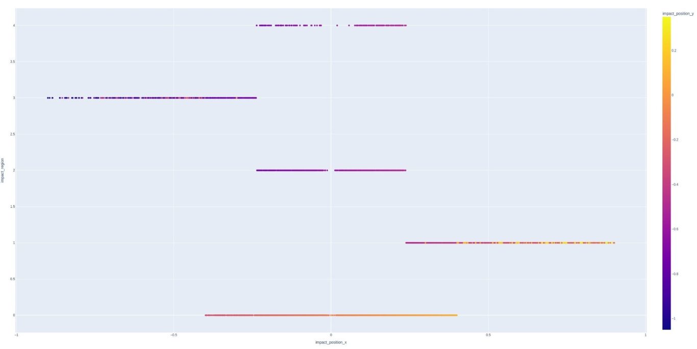
Here we can start understanding the impact regions. There is a hard line between regions 1, 2, and 3. Region 3 is ~ x < -0.23 and region 1 is ~ x > .23. This makes it clear that regions 1 and 3 are to the left and right of the sweet spot. This leaves zones 0, 2, 4, which all are between the range above, + ~0.23.
Zone 0 is unique in that there is some overlap with all the other zones, but only limited overlap with regions 1 and 3. Let's take a look at the region vs y location plot now:

This is a little less clear. The first thing we see is that regions 1 and 3 are split when we look at the y data. Also, range 0 has overlap with everything except 2 and 4. I think we are starting to see that region 0 is likely the sweet spot. Regions 1 and 3 indicate a miss (+/-) in the x direction, leaving regions 2 and 4 to indicate misses in the y direction. The overall range of y is -1.05:0.35 which indicates the sweet spot is in the middle of the x range, but higher up in the y direction. This seems like a reasonable assumption and would indicate that the y-direction is the length of the racquet, while x is the width.
Let's look at a histogram of impact regions:

Region 0 is the sweet spot, and is the most common outcome. Region 1 is left of the sweet spot if the racquet is held upright. Region 2 is above the sweet spot and is about the same as region 3 which is right of the sweet spot. Finally, the least common outcome is region 4, which would be near the neck of the racquet. This appears to be pretty reasonable.
However, the pairplot of impact x and y is very strange!
X - Y pairplot - 3D
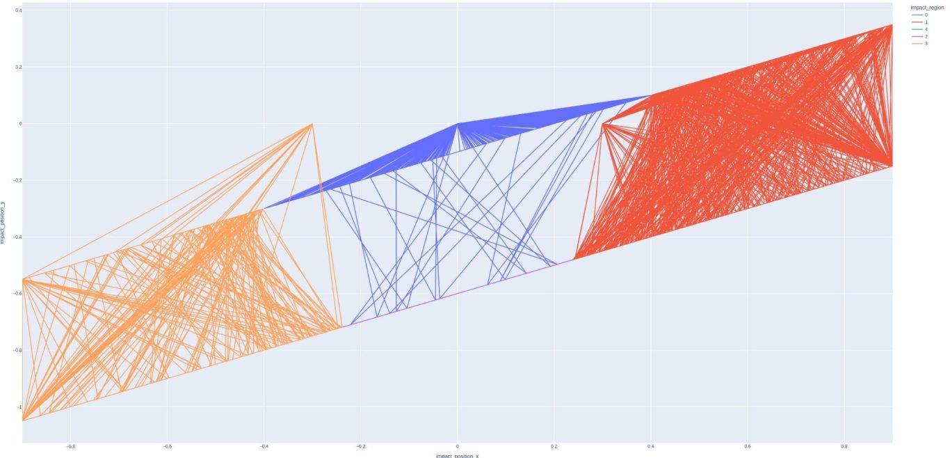
XY Line plot - color by impact region.
What have we learned?
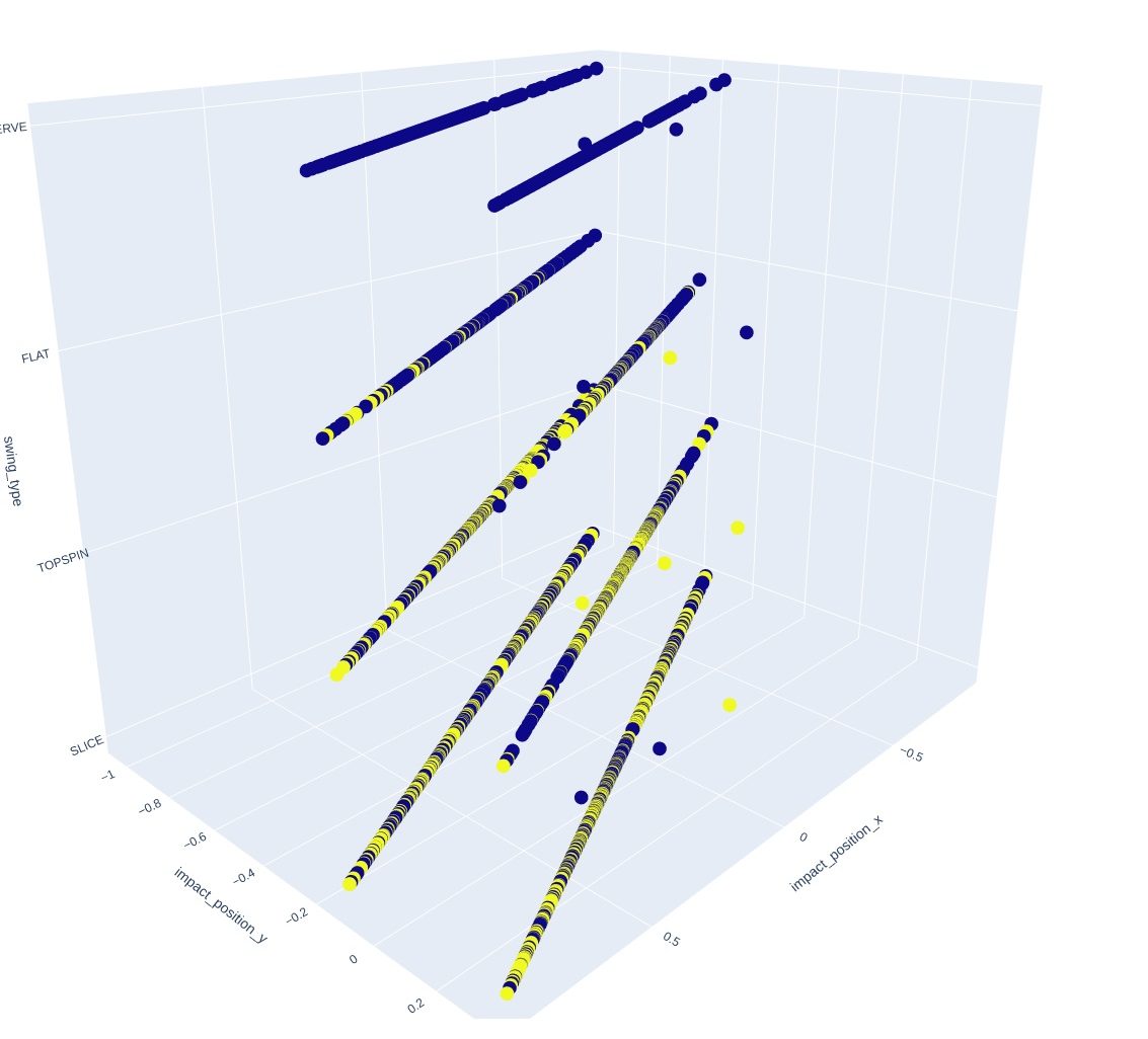
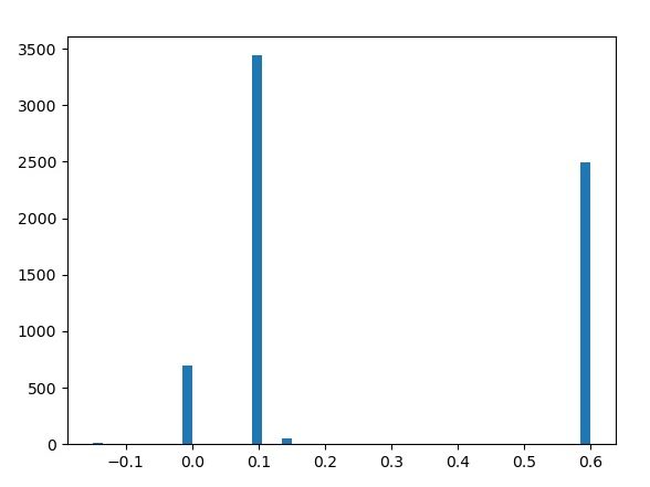
Again, it's hard to say. But, it's clear that there is a shift based on the x value. I added a new column called diffxy which halved the x value and then added the y value. Here is the histogram that makes it clear the the y value is shifted either by 0, 0.1 or 0.6. Everything else is an outlier.
This is a 3D plot of x, y, and impact region. We have a pretty good idea of what impact region is, but the xy plots are a real mystery. There seems to be a translation of one into the other, instead of a grid pattern that one might expect. I looked at a few points and the relationship between them appeared to be y = 0.5x -0.1 (or -0.5.) I suspect there is some kind of encoding scheme here, perhaps to save memory space. Let's look at a line plot and see what we find.
It's still a mystery as to why this is the approach. As I said before, maybe it allows for memory saving. Maybe this isn't all that important though. Let's try to look through the raw signals now....
Update on XY position
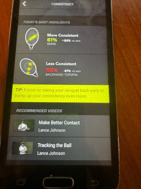
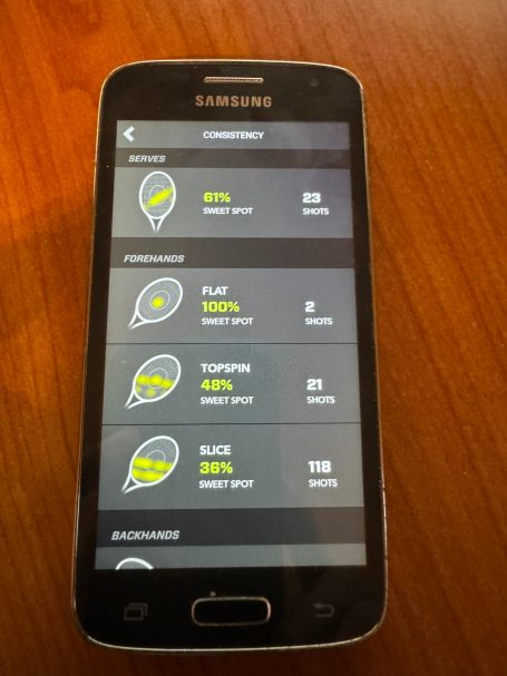
As mentioned earlier, the XY plots are very difficult to understand and appear to be straight lines. I looked at the app, and this appears to also be the case there. This doesn't tell us much, but indicates that the striation in the XY data is consistnt with what the app outputs.
Again, it's tough to know what to make of this, but the positional data does seem to have some predictive value, even if it's not quite clear what going on with these plots. It's clear that the positional data is single axis, and sometimes has a shift closer to the handle of the racquet. Interestingly, the angle appears to be different per stroke. Serves have about a 45 degree angle, backhands about 90 , and forehands almost zero. The shifted contact point is best seen in the slices, but is present in other strokes as well.
Sensor values
As discussed previously, all signals starting with dbg were separated as it is assumed that these are raw signals.
Let's see the pairplot again.
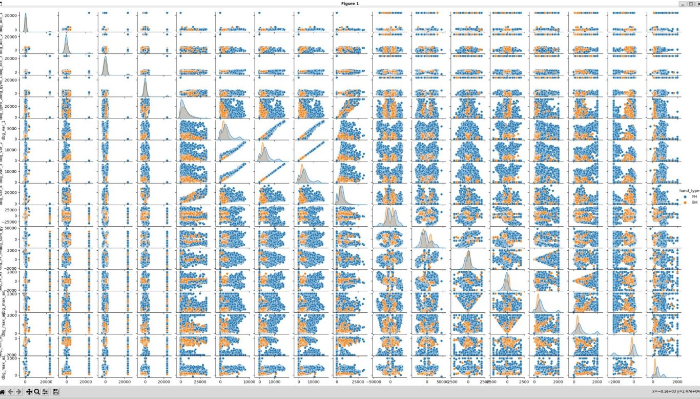
The hue setting is my swing_side, forehand or backhand. Interestingly, no signal on it's own is enough to distinguish between swing side. I wonder if the hypothesis that these are the only sensed signals might be incorrect. We'll have to keep looking.
Let's start thinking about ridge regression again. As you remember, we didn't have a target before. But, now we've studied the data a little more. Maybe we can start using some of the calculated values as the target?
Remember, we seem to have two sets of data from the sensor. Raw data that references internal sensors (3 axis accelerometer and two axis gyroscopes) or internal signals which seem to be var and summations of accelerometer and gyroscope. Var is a mystery, but three vars are highly correlated with each other. Var 4 correlates quite well with gyro2.
The 2nd set of data is what I'm calling calculated. This is stored in the same database, but I believe it is calculated directly by the sensor. These fields are backswing_time, power, ball_spin, impact position x and y, and impact region. For now, let's ignore impact position y and region, because the calculation wasn't fully understood above. Backswing time will also be ignored for now.
That leaves power, ball spin, and impact position x, which is pretty close to the data we've been getting from other sensors. I believe that swing_side is also a calculated field. This is an interesting idea, since it's not obvious how this would be calculated.
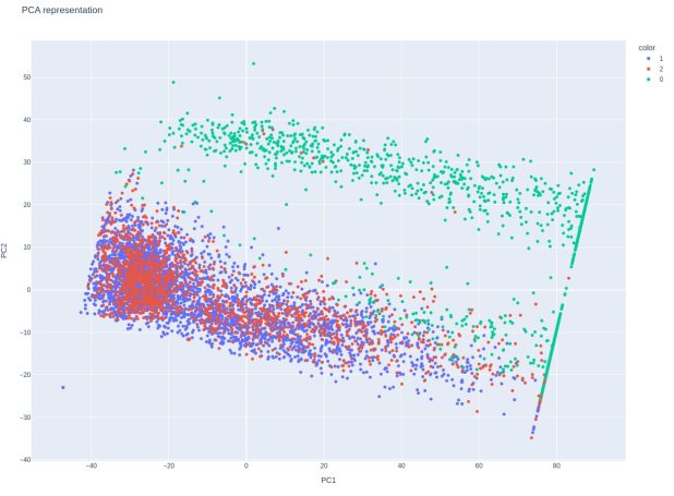
PCA is an interesting choice here to predict swing side. We have 9 sensors of which none show a clear distinction between forehands and backhands. However, PCA takes these 9 features and condences them into 2(in this case).
Look how clearly we can separate classes when using a PCA: [Forehand is blue]
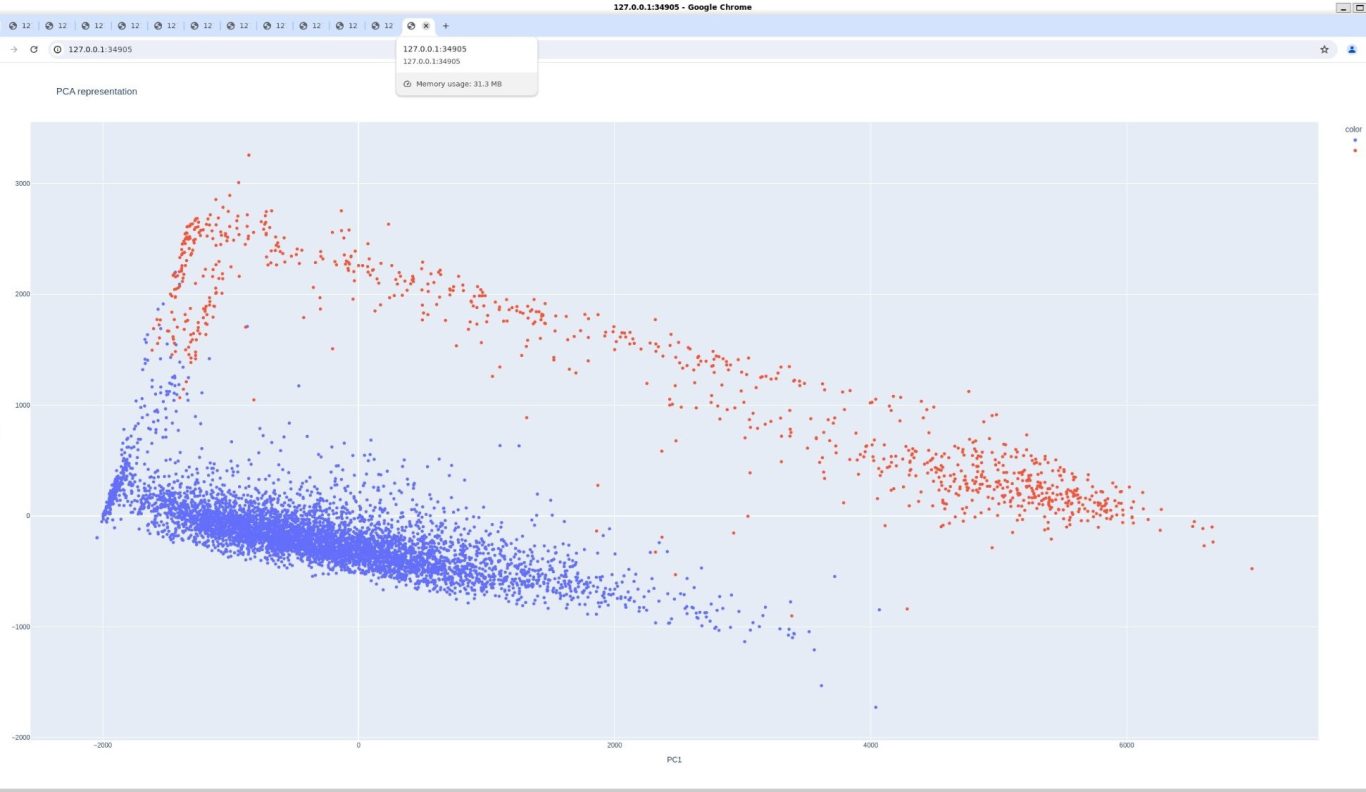
Perhaps the sensor has something like this built in? We'll have to look further into this. But, we still need to look into the other responses...
More plots
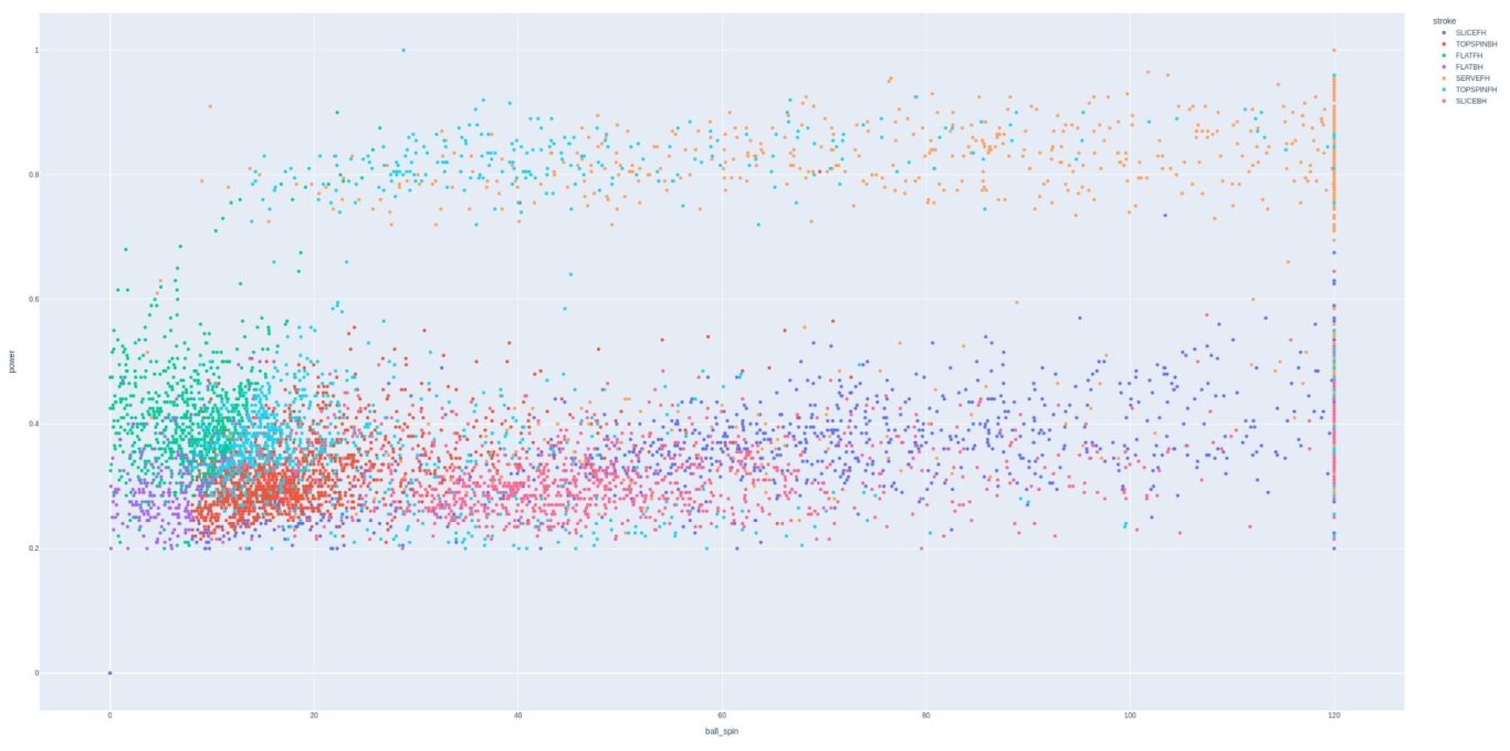
Power vs ball spin might be the most illustrative scatter plot. These can be considered analogs for x and y motion, both through, and under/over the ball.
There is a clearly distinct population of strokes that are hit with both power and spin, and these are the topspin forehand and serve. This is well reflected in this plot.
In addition, we can see that power appears to be capped at 1, but almost never reached. Ball spin is clearly capped at 120 and this maximum is often reached, as seen by the striation.
One possible troublesome aspect of the data is that forehand slice is the stroke most often hit with high spin but low power. Although this might be possible, forehand slices are a very unusual stroke and probably shouldn't be so heavily reflected. We'll have to keep an eye on this...
Where are we now?
It seems like we're getting somewhere, but it also seems like we're starting to see the same things. Forehand topspin and serve stand out as shots that are hit with both power and spin.
Notable issues:
X-Y distribution isn't plottable due to some encoding which relates x and y to each other. Each factor seems to consistent on their own, so the data does seem credible. More contact happens to the left of the sweet spot in the x direction, and is reasonably well centered in the y direction.
Forehand slice is featured heavily in the data, and is probably masking another shot. Experimentation with sensors shows that they aren't perfect. One sensor was known to mistake topspin 2nd serves as backhands. This was seen with a bimodal distribution. Perhaps something similar is going on here.
Backhand slice seems to be hit with more spin that backhand topspin. This should be investigated some more.
We don't know how backhand vs forehand is chosen, although experimentation reveals that the distinction is immediate and almost always accurate.
Let's try to model our data. We'll split our data into training and test sets, and we'll see how well we can use the sensor data to predict what I believe are calculated fields.
What side?
How does a sensor decide what stroke you are hitting? For that matter, how does a sensor determine what side a stroke is on?
In my opinion, this must be decided by the sensor based on all of its inputs. I believe that it is a hardware calculation on the sensor itself that decides instantly how the stroke is scored.
If we look at the column names, perhaps we can get a further clue:
'dbg_acc_1', 'dbg_acc_2', 'dbg_acc_3', 'dbg_gyro_1',
'dbg_gyro_2', 'dbg_var_1', 'dbg_var_2', 'dbg_var_3', 'dbg_var_4',
'dbg_sum_gx', 'dbg_sum_gy', 'dbg_sv_ax', 'dbg_sv_ay', 'dbg_max_ax',
'dbg_max_ay', 'dbg_min_az', 'dbg_max_az'
Acc1,2,3 and gryo 1,2 are clear. They are acc in x,y,z directions, and gyro in xy. This can be seen from the summary signals sum_gx, sum_gy and from the max ax ay az signals. Even though these are labeled summary and max signals so much be derived from the core signals, the pairplot doesn't really indicate this, so the factors will be considered separetly for now...
What's less clear is what sv_ay and sv_ax are. Let's assume they are similar to min az. The last mystery is what var 1-4 are? Var 2 and 3 are perfectly correlated. Var4 and gyro2 have a strong relationship:

One thing that is clear is that the 'dbg_sv_ax', 'dbg_sv_ay' signals are absolute values. This can be seen by the clear funnel shape in the pairplot. There are some interesting plots to look at, but before we get too into the weeds, let's look again at the calculated fields pairplot. This time the hue is by impact region and I've added the diffxy column, which seems to part of the encoding of impact_y
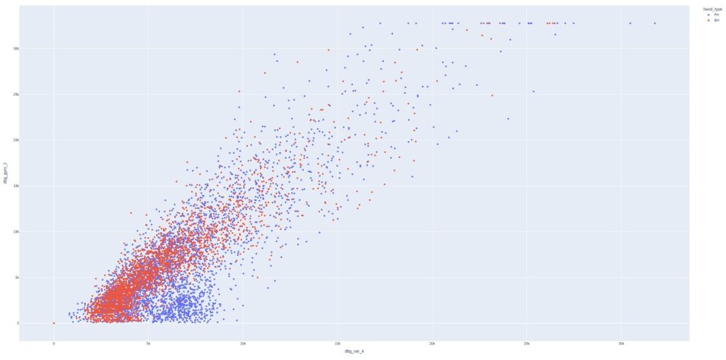
Let's look at the pairs plot again, this time with var3 removed.
Let's zoom in on just two plots...
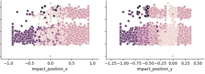
It would be nice to have an x-y plot like was saw in the Zepp2 sensor. However, the encoding isn't currently decodable by me. I don't think it matter much as the plots above illustrate that there is a clear x and y distribution and the zones correspond to what was mentioned before. Most interesting is that there is a clear shift in the positive direction for x and not y. I believe this is because topspin is the goal of most shots. This could mean that it is more likely to hit on the front of the stroke because the ball remains on the string during the stroke.
There is a very similar pattern on the y graph. The higher the racket speed shots have a skewed right distribution, exactly as in the x graph. However, I believe this is from a different cause. I believe that shots hit near the racquet throat have very little power and, therefore, reflect more poorly in racket speed. I believe this because the rest of the distribution is symmetrical around the sweet spot, unlike in the x graph.
What side, though?
True, we never really answered that. Let's do that modeling we've talked about. Remember how it works, we randomly split our data into training and test sets. We then build a model based on the training data and predict the outcome.
Since swing side is a categorical variable, classification is necessary for building a model. When using the 9 sensor readings, logistic regression predicts 80% of the strokes correctly. This is clearly not the approach taken by the sensor when making the calculations.
What about a decision tree classifier? Well, that was a more promising approach. I got about 96% prediction accuracy! However, this required a cross validation and a parameter grid, meaning two hyperparameters were varied at the same time. I think this would be too difficult to build into the sensor.
Here is feature importance of the decision tree classifier:
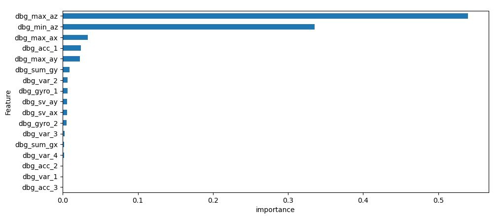
This does seem to indicated that the z direction accelerometer is the most important factor. What if we revisited our previous PCA analysis? That did seem to form two very distinct groups in the visualization. However, when I used this to predict the outcome on test data, I only got something like .74 accuracy, which is much lower than the Random Forest classifier. This might have to remain a mystery for now. Let's try to look at some continuous responses now...
Continuous responses
We had some luck predicting swing side. In fact, using a sophisticated model, we could predict swing side over 95% correctly. From sensor use I know it is not completely accurate, with at least one sensor consistently mixing topspin serves and topspin backhands. I believe that there is an algorithm programmed in the sensor that gives immediately feedback on whether a stroke is forehand or backhand. Perhaps it is a hard coded look up table type function. From what we've seen, it probably focuses most on the z direction accelerometer.
Let's continue along this line of thinking and see what we can predict about ball spin, racket speed and impact position based on the sensor output. Let's go back to our friend ridge regression!
Here is how racket speed is broken down by factor:
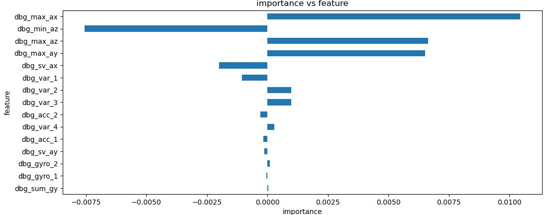
Now ball spin:
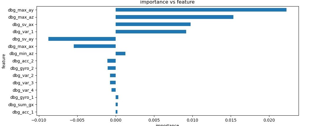
These are pretty interesting graphs. Remember, racket spin is in the x-direction and ball spin in the y-direction. These are clearly the most important factors here as well, lending credibility to this analysis. One thing to note is that racket speed is predicted more correctly than ball spin. I don't know what the significance of that is.
Let's continue with the x and then y impact position importance bar charts:
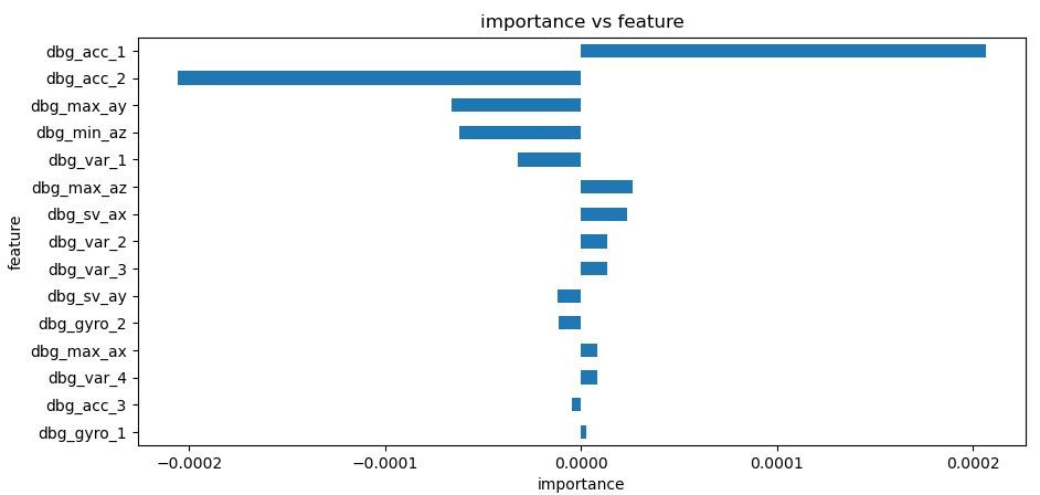
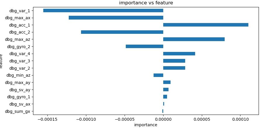
Since the X and Y impact locations have completely different importance factors, I think it's safe to say that they are independent variables, even though they are related to each other through a formula as discussed earlier. Probably, if we can transform the y-axis data, it would form a x-y scatter output as seen on the Zepp2.
It's tempting to continue along this analysis, as it's very interesting to see how the sensor works. But, I would like to proceed in what I think is a more practical application of this data analysis... Sensor comparison!
Coda
Since I felt I was at the end of what I wanted to analyze, I searched the web again for information about how tennis sensors work. I was able to find a source who appears to be highly knowledgeable, but I won't directly link to them because it was in an informal setting.
My take on the gist is that tennis sensors are extremely complicated. Much more so than golf sensor, because the golfer is stationary. Another problem is that the sensor needs to distinguish between actual shots, and things tennis players are known to do, like twirling the racket between points and hitting their knee with the racket. He added that all the tennis sensors on the market use the same equipment, the only real difference is in the software. They are fundamentally measuring two things, racquet give upon impact (this is why volleys are so hard,) and vibrations linked to racquet twisting. This is what allows them to estimate impact location. All sensors on the market have the best possible accelerometers and gyroscopes, and have the fastest possible on-board processing power. This means that complicated solutions that I mentioned above (CV Grid hyperparameters) are entirely feasible nearly instantaneously. There is a need for both accelerometers for impact and gyroscropes for vibrations to be references against each other to rule out false alerts... It also sounded like the speeds of each mattered, in that the vibrations come after the impact so this time frame needs to be taken into account. I think this might help explain the summation features.
One final thing to note is that the sensor is really just estimating how much spin the racket has imparted on the ball. This means that the speed and spin of the incoming ball shouldn't matter. However, experience has shown that it does matter on the Babolat POP, but I believe that is in their processing of the signals.
Upon reading it again, I'm not totally convinced about that previous paragraph. Maybe the incoming momentum of the ball does have an impact on the readings. I guess what I've noticed is that the reading are consistently higher for matches than practice.
We need your consent to load the translations
We use a third-party service to translate the website content that may collect data about your activity. Please review the details in the privacy policy and accept the service to view the translations.
