Tennis Histos
Heaviness

Ball Speed

Spin

Notice anything?
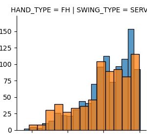
There's a lot going on here! But, if we remember the last data set, some of the same things are going on. Let's zoom in on three subplots. First, serve ball sped. Then, serve spin and finally topspin forehand spin.
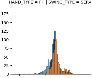
The first thing that jumps out at me is that the serve has an extremely high % of hit frame. Another interesting thing about the serve is that ball speed and heaviness have relatively normal distributions, while spin is skewed heavily to the right. Looking just the next graph, we see that forehand spin is skewed heavily to the left.
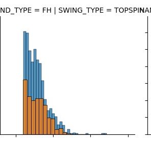
Here's another interesting plot of backhand topin. This has a bimodality in it. Bimodalities often indicate subpopulations with different characteristics.
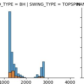
This definitely has the characteristics of two subpopulations. The lower spin population is clearly left skewed while the higher spin category is smaller and clearly right skewed.
Again, most data is impossible to fully interprety with domain specific knowledge. In this case, I believe that the higher spin category are actually serves that are miscategorized as backhands. The spin values and skew fit the serve population very well, while clearly being different that other backhands. Interestingly, this subgroup doesn't seem to appear in ball speed and heaviness.
These charts are from the Zepp2 tennis sensor. This sensor is discontinued, so please don't purchase it, even if you get a great deal on Ebay. If you do still have one of these, please don't logout of your account. It appears that you might be able to maintain access, but once you logout (like I did) you won't get back in.
The data is still interesting to analyze.
What follows is a set of histograms and scatter plots, all trellised in the same fashion. There are 2 rows. Top row is forehand and bottom in backhand. 1st column is serve (note no backhand serve), 2nd is topspin, 3rd is volley, 4th is flat, 5th is slice and 6th is smash (again, no backhand for this column. Orange hue indicates "hit frame" while blue is "no hit frame." Each set of histograms has a different attribute.
Each shot is measured on three attribute. Heaviness; Ball Speed; Spin
It's hard to know what to make of each category, but the number of categories gives us our best clue. Tennis shots can very easily thought of in 3 dimensions. Horizontal power, vertical power, and sweet spot contact. Increasing horizontal power increases the velocity of the shot. Vertical power increases the spin on the shot. Vertical power can be though of as plus/minus due to slice being the opposite spin as And hitting in the middle of the racquet (sweet spot) increases at least horizontal power due to a scientifically understood "trampoline effect". Hitting the in sweet spot is always a good thing though, so might also increase spin. It would interesting to understand more about this effect.
How do these categories line up with what is known about hitting tennis shots? First thing we should do is look at the ranges of each category. A quick check of the distributions reveals that the maximum value for spin is 4000 and this appears to be limited by the sensor. Rafeal Nadal can hit is forehand at about 5000 RPMs, so I believe this corresponds well with what is known about RPM (Revolutions per minute).
The max value for ball speed is about 150. This would match reasonbly well with KPH (kilometers per hour).
Heaviness is the most mysterious category. The max seems to be 500. It's hard to know what this is measuring. Another clue is that it's a continuous variable. I am going to assume that this is calibrated to excellent players, and is some reference to the amount of recoil upon impact. I am also going to guess that in some way, this will be at least an indirect analog for hitting in the middle of the racquet, just from what is known about hitting tennis shots.
More graphs
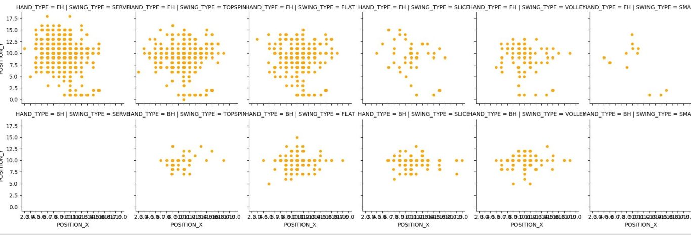
Let's look at trellised graphs like before, but this time by x-y position. Hue is whether frame is hit.

Here is hit frame only.
No frame only
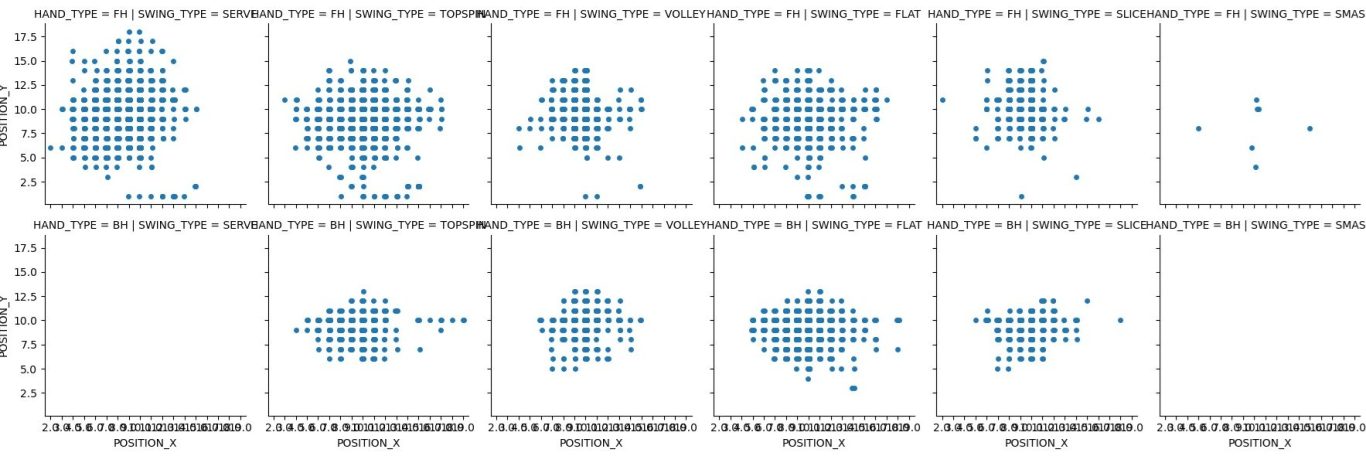
What does this mean?
It's pretty tough to say. The x-y position scatter plots seem to indicate tennis racquet sized patterns. Earlier data indicates that the serve has the widest spread and this data acknowledges that. But, the frame hit parameter seems to be suspect.
Let's look further into a few of the plots, specifically serve, topspin forehand and topspin backhand
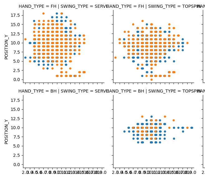
This combines hit frame and not hit frame, which seems to be a false signal and will be ignored.
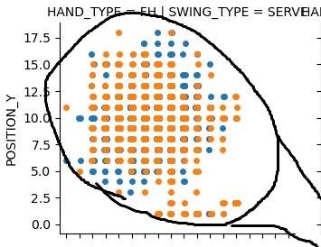
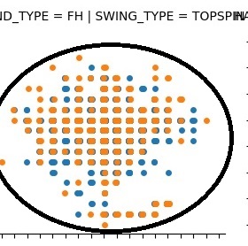
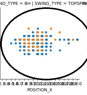
Both the serve and the forehand (top row), have clear traces along the bottom that resemble the frame of a racquet. The serve pattern is a little more circular than the forehand pattern, but otherwise they are similar. The backhand pattern is much tighter, and, even though this signal seems suspect, seems to have less frame contact(orange.)
Again, data set knowledge is paramount. This data set spans several years and matches what is known about the player: Marginal serve hit with spin, average forehand, backhand best shot.
Closer look
This is forehand serve, topspin and backhand topspin,. This time a hypothetical racquet is superimposed.
The forehand appears to have most frame contact at the bottom of the racquet, which indicated an upwards motion. The backhand has very little frame contact. The service motion is similar, but the frame contact might indicate a 45 degree swing motion. Also interesting is that the hit frame color seems to occur more in the middle than the edges, other then the bottom frame contact. Again, the hit frame signal seems to be at least a little corrupted.
We need your consent to load the translations
We use a third-party service to translate the website content that may collect data about your activity. Please review the details in the privacy policy and accept the service to view the translations.
