Dashboard
These are 4 different pairs plot screenshots from a dashboard. The top row is using a small (constrained) time range and, therefore, doesn't have much data. The right column enables the "hue" parameter separates by activity by showing different colors for each.
Garmin Heart Rate Monitor
We've already had a rollicking time with the heart rate monitor. But, we haven't talked Garmin yet!
Garmin has an excellent interface for getting every bit of your data! Go Garmin!! Let's rollick further!

Analysis
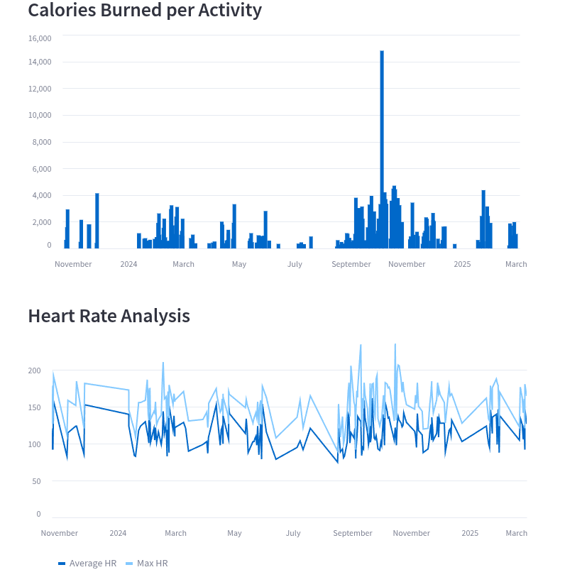
This is pretty interesting! We are looking at duration in the top graph, and average and max hr in the bottom graph.
The athlete in question sure did have one outlier of a performance! Can you spot it?
I bet you can!
There is also some interesting grouping that indicates clusters of activity, meaning this athlete apparently trains for specific activities.
We need your consent to load the translations
We use a third-party service to translate the website content that may collect data about your activity. Please review the details in the privacy policy and accept the service to view the translations.