PIQ vs. time analysis continued
Surely I can't be the only one excited by this chart?!?! Fear not, we'll plow ahead.
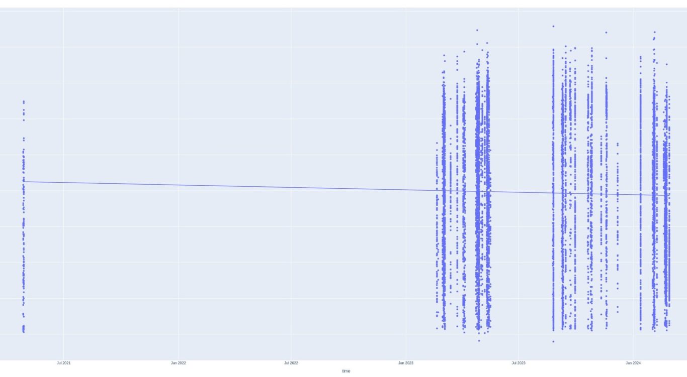
Let's think about the data again for a second. Remember, the BabPop is a much more simple sensor. When both sensors are used together, the Zepp is clearly more accurate counting strokes, but the Pop still does pretty well. 95% would be a reasonable guess, and maybe it's ignoring weak shots which wouldn't be so bad. The Pop has a large advantage in that it can be worn during matches so it's the only source of match data.
Another thing to remember is that each series of dots is a session. There can be multiple sessions per day.

PIQ vs. time analysis continued - NOT!!
Well... Hold on here!!!
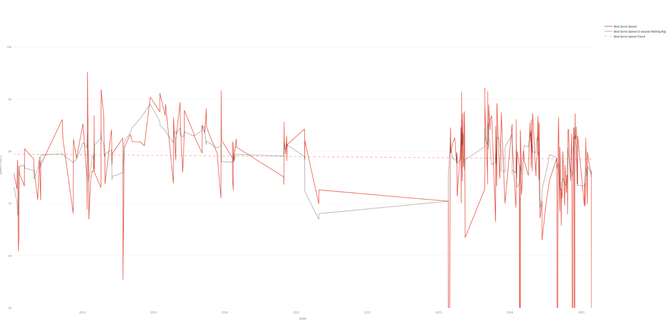
I'll have to concede that this isn't a PIQ chart. It's a best shot chart which means that the fastest shot of each session (MPH.) Another concession is that I really don't know where I was headed with that earlier part of the analysis. I'm going to leave it in for now just in case I remember where I was headed.
But, fear not loyal fans of the 'site, I've got what can only be considered a bombshell!
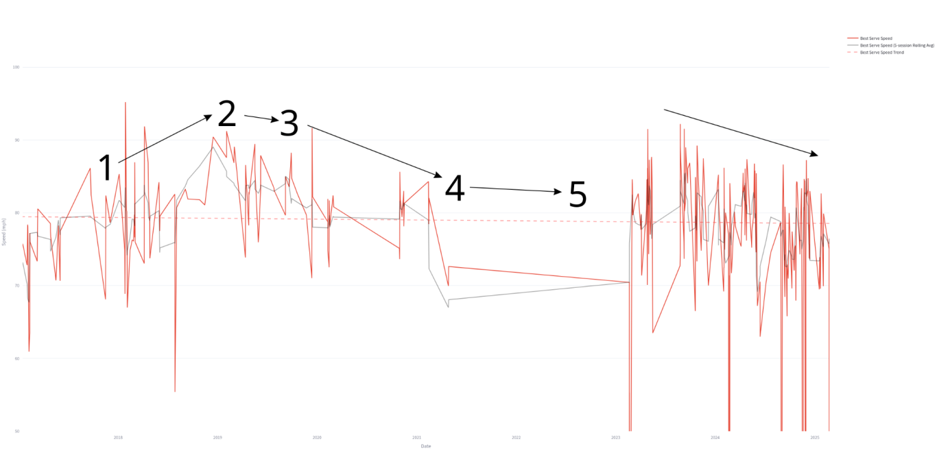
That's right, this chart explains two known facts about the player under analysis.
- Player's serve velocity started increasing as a results of a training program
- Player noticed that serve velocity was plateauing but continued training program.
- Player noticed velocity was dropping even though training continued
- Player tried increasing rest, increasing training but couldn't find anything that worked
- Player stopped training but kept playing
That was just the first fact!!
That's right. If you look closely at the data, you might start being able to put numbers to the data....

Did you have the numbers that same as the player?
You've got to admit, that lines up pretty well with the data!
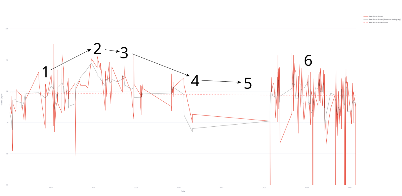
Now, you're hooked... I get it... And, you're wondering about the 2nd part of the chart. I know it, you're seeing another decline...
Something like this?

I see it too!
It looks pretty clear!
Do we have something? Does the decline have something to do with the 2nd fact?
Alas, no... At least the player doesn't think so.
This is a very important lesson in both data visualization and statistics. Don't believe what you see. Make sure a context expert reviews any analysis.
In speaking with the player, more information comes up. First off, although there appears to be a gap between 4 and 5, the player indicates that he didn't stop playing. Rather, he was having trouble with the sensor app.
And, the 2nd fact that I alluded to earlier, The player switched to a spin serve around time period 6!

The player doesn't believe that the 2nd decline is real. He thinks it's more a matter of more fully committing to the spin serve (which means hitting it both 1st and 2nd all match long,) and also focusing more on placement rather than maximum spin, which was the goal when first switching to the spin serve.
The player also mentioned that this is clearly just an indicator, and not the entire question, since this is only measuring fastest serve. He said that, especially with the spin serve, the goal is rarely to hit as fast as possible. That said, they clearly think this reflects what was going on overall. Although there seemed to be some good days, they mentioned that the first serve worked less and less well. Trying to hit harder is well known not to work for increasing serve speed. This leaves leg drive, smoothness, and fitness as the only variables under the player's control, and they said they weren't able to get the combo right.
Switching to the spin serve gave the player a chance to stay on the court longer and put less stress on their known shoulder conditions. Think a #2 or #3 baseball pitcher switching to spin once their stuff has faded. Jamie Moyer played until his late 40's! Even the great Randy Johnson, possibly the most talented pitcher in history, closed his career out with spin!
This is pretty cool!
Are we done?
Yup, but I can't leave anything on a totally positive note. Although, the is definitely interesting, it shows a clear downside to sensors in general
Although the sensor can help visualize the decline, it can't stop it!!
We need your consent to load the translations
We use a third-party service to translate the website content that may collect data about your activity. Please review the details in the privacy policy and accept the service to view the translations.