More PCA?
No, the PCA is what what started the analysis, but this turns out to be more simple. Let's think back to a PCA. Principle Components Analysis. We have a 17 dimension system. The PCA reduces the 17 dimension variability to 2 dimensions. This is what we see in this plot. We need to forget the typical way of looking at a scatter plot in that this isn't x-y representation, the axes have been shifted to the direction of most variation.
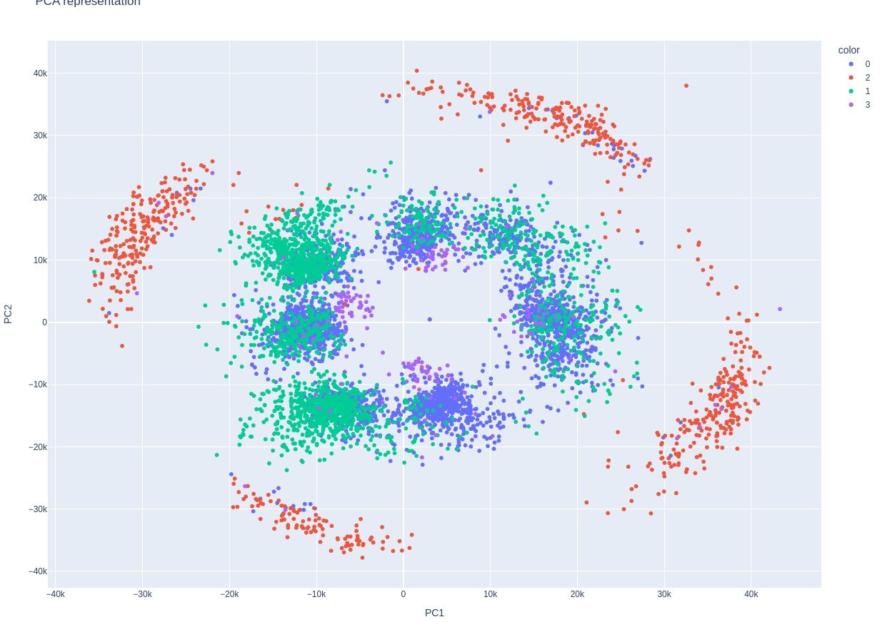
Now let's look at another interesting chart, where we put two signals on a traditional x-y scatterplot:
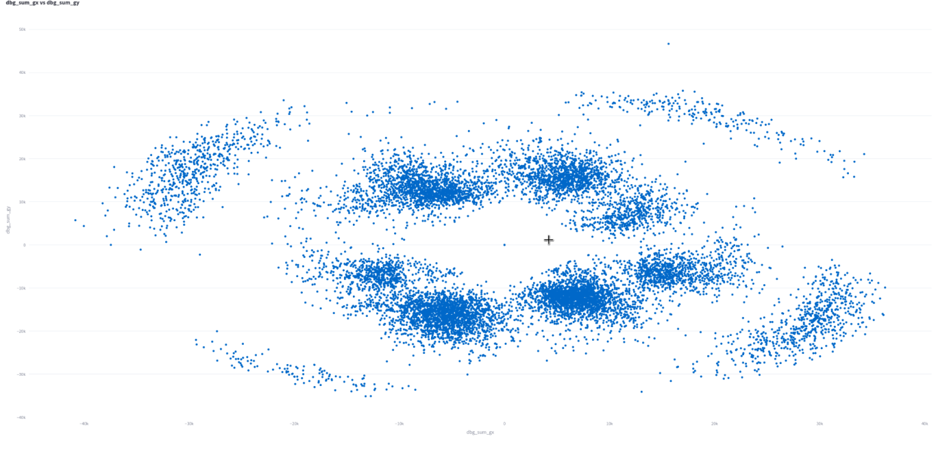
Yup! This is the same pattern. But, it's just two signals, sum_gx and sum_gy! We're still seeing the same pattern though. This means the PCA is almost certainly capturing these two signals. Now, if we could just understand why it looks like a racket...
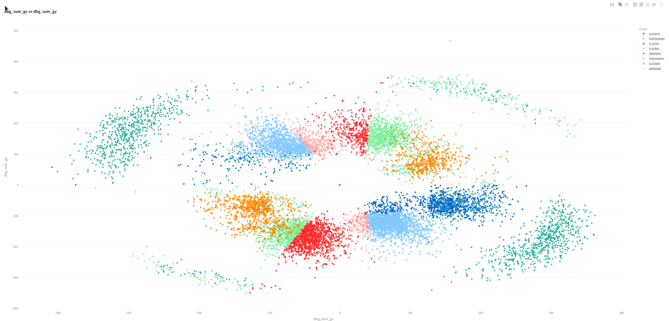
Would you looky here!!!
This is the same chart, but the color is set by stroke.
You'll just have to believe me because the legend is small, but this is a pretty fascinating chart!
The first thing that is clear is that the pattern is symmetric across the equator. This means the NW corner is mirrored SE. Both these clusters are serves exclusively. The NE and SW corners are topspin forehands primarily.
The symmetry is clearly due to the two sided nature of a tennis racket. Topspin forehands and serves are the "power" shots in tennis in that they are hit hardest and with the most spin. This is why they are separate from the rest of the data.
The rest of the data divides into 4 groups:
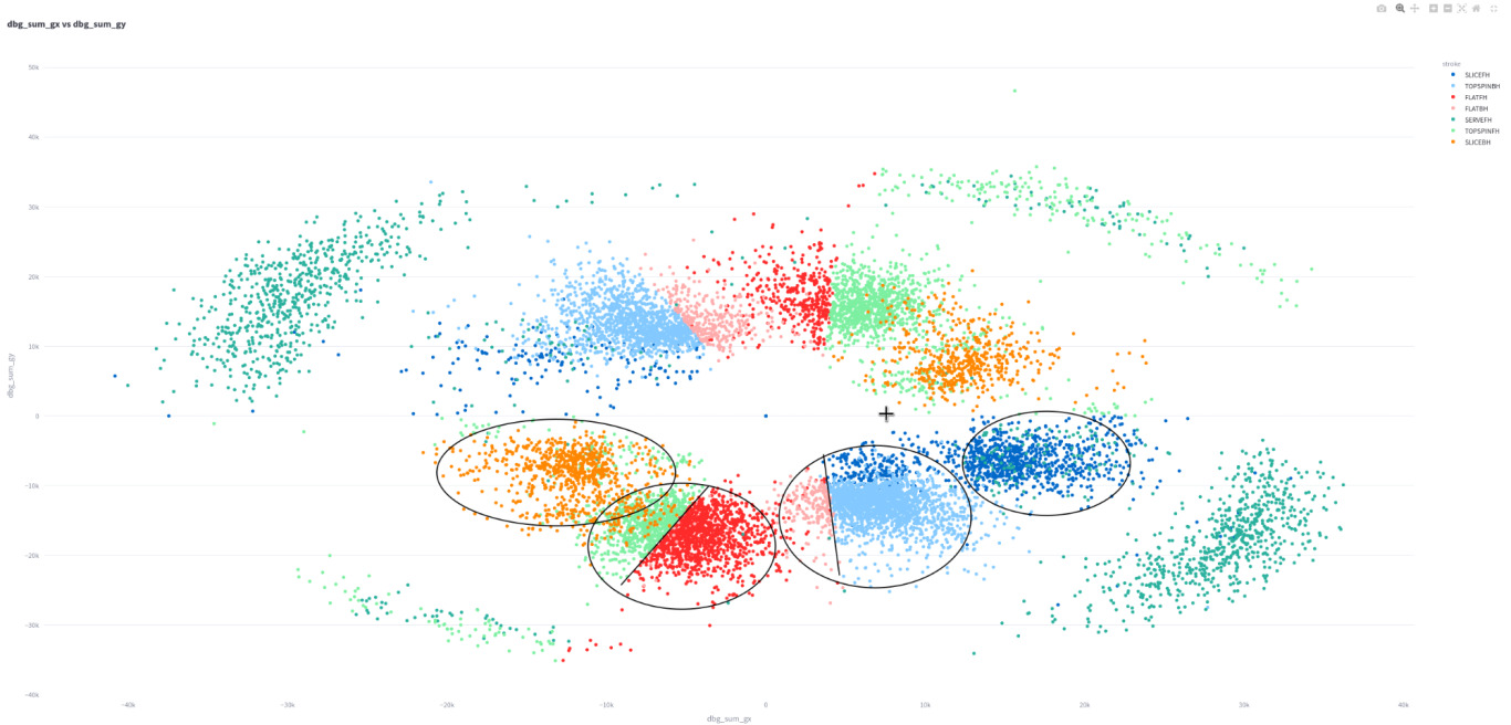
Notice how I've circled each distinctive cluster. From left to right, this is slice backhand, forehands, backhands, and slice forehands.
Even more interesting is that most forehands and backhands have sharply distince lines within their groups. These are the difference between flat and topspin strokes. It's clear that sum gx and sum gy capture the gryo signals across the entire stroke and are clearly used in stroke differentiation.
We are learning so much! There are two more gyro signals, 1 and 2. I believe they explain why the more powerful strokes have a curved characteristic.
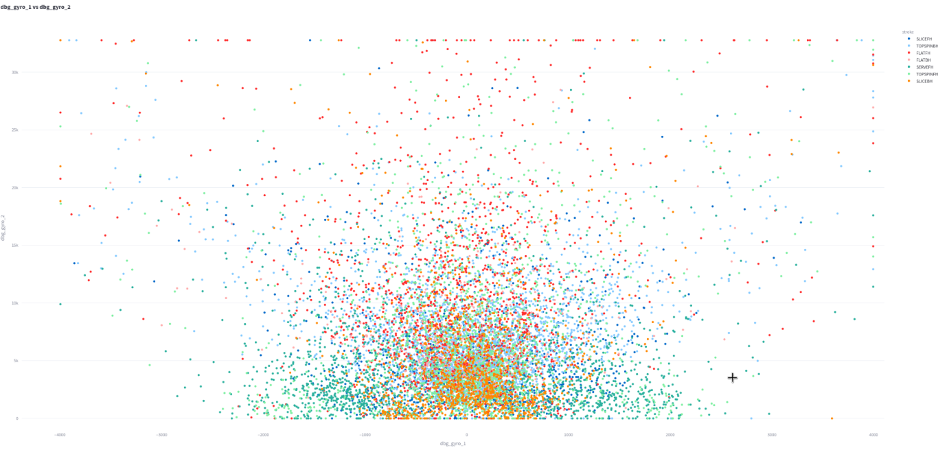
This is gyro1 vs gyro2. They are probably the peak reading of each gyro1 is symmetric around 0 while gryo2 starts at 0.
Notice the square nature of the signals. This is clearly because they can be maximized. This is why the extreme signals in the above plot have a curved nature as they reflect signals that have one of the gyros maxed out.
Next steps?
Now we are really getting somewhere. The gyros appear to be key in stroke determination. It would be nice to see what the accelerometers are doing as well. We also struggled with the x-y position. Let's look at that again...
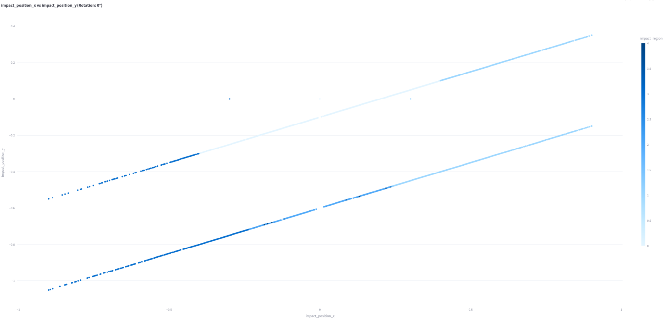
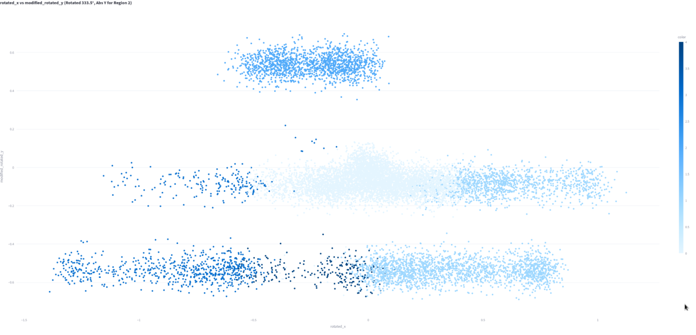
This is exactly the same data as above, except I've rotated it 333.5 degrees and taken the absolute value of zone 2, putting it above the sweet spot. Finally, I've added jitter. The lightest zone is 0, which is the sweet spot. Zone 2 is directly above it, and zone 4 below it. Zone 3 is left of the sweet spot and also lower left. Zone 1 is right and lower right.
This is a pretty reasonable approximation of a tennis racket!!
This shows impact region x vs y. Although it doesn't look much like a tennis racket, this is actually a very crude visualization of one. The lightest color is zone 0, the sweet spot. On the same line are zones 1 and 3 as described below. The line below has zones 1-4. The reason for the two lines is that this is a 2 axis gyro, so it only reads direction in one direction accurately. However, it can also shift the data to the lower line. The coding is strange (rotated by 333.5 degrees) but I believe that this better reflects the tennis racket:
3D?
Glad you're thinking what I'm thinking!!
We've got a reasonable approximation of a tennis racket, and we're interested in things like power. Let's add that dimension!!
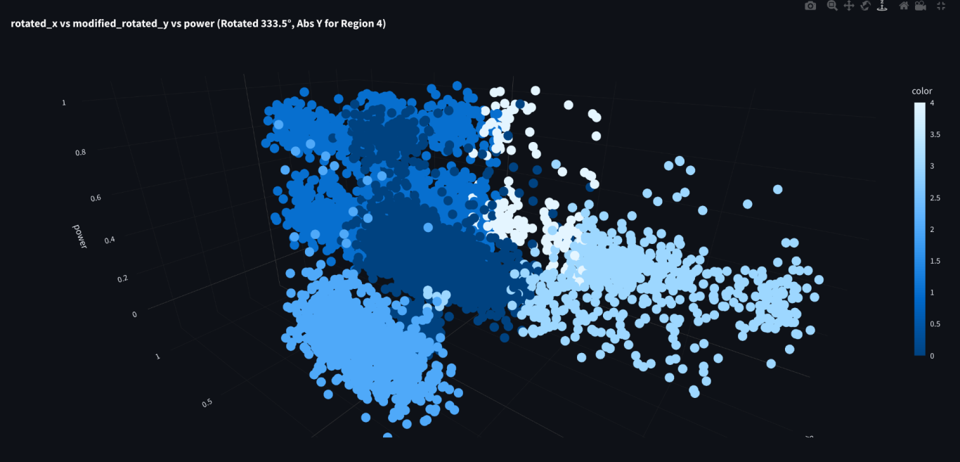
It's hard to pick just one screenshot of a 3D graph. It's better to rotate it around so you can get an idea. But this graph shows that the power depends heavily on impact zone. The sweet spot has maximum power. This is probably what we would expect. But zone 1 also indicates similar power, which is very interesting. Zone 4 (near the neck) shows some powerful shots as well. Zones 2 and 3 do not register any powerful shots at all.
Zone 4 (near the neck) is not an ideal place to hit a tennis ball, but testing shows that this is a 2nd sweet spot and one of the most powerful parts of the racket. So, this observation does make sense that it can produce powerful shots.
Zone 2 is above the sweet spot and not a great place to hit a tennis ball, so it makes sense that it doesn't produce powerful shots.
Zone 1 vs 3 is the most interesting part of the graph I think. Since they are on symmetrical sides of the racket, they have the same characteristics. However, zone 1 shows performance similar to the sweet spot, while zone 3 has no powerful shots.
In my view, zone 1 is always leading the sweet spot and the 3 most important strokes. I think this indicates that it doesn't hurt to be "early" on a stroke, but there is a big penalty for being "late."
We can't be sure if this is true without validating the analysis, but I think this is possibly an interesting 'lemma.'
Here's another look at the same graph from a different angle.
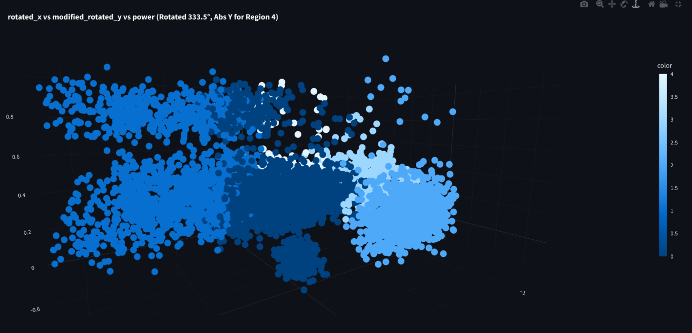
There is another interesting characteristic. A "lobe" at the bottom of the graph. The is a separate group of shots hit in the sweet spot with zero power. These zero power shots don't exist in any other zone. I think these are set up shots. They are usually hit with forehand slice and are neutral balls just meant to set up a rally.
Let's change the colors and see what we think!
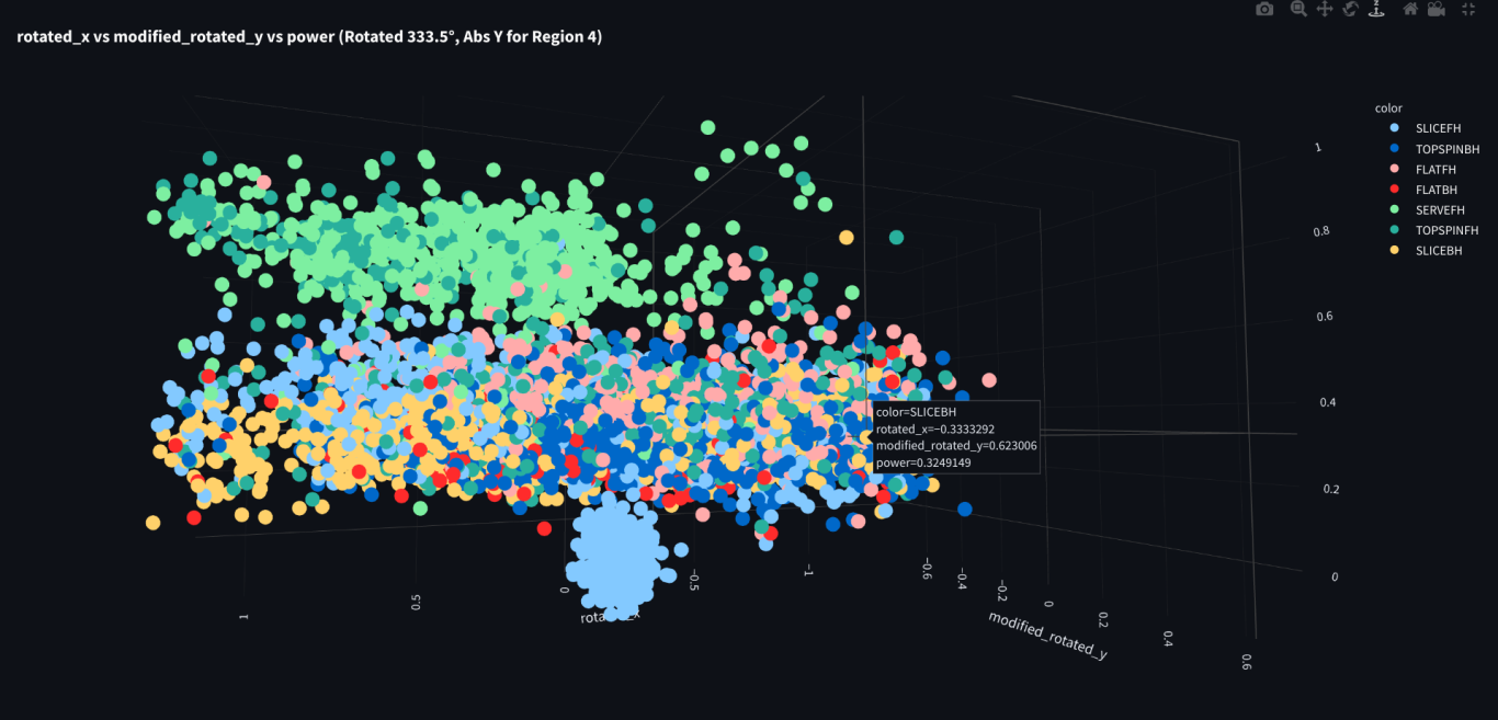
This is exactly the same data as above, except the color is now by stroke. Sure enough, the lobe is entirely forehand slices!
It's nice to be right every now and then!
We're on a roll! But we still need to investigate the input factors further. We've done ridge, but maybe we haven't totally understood it yet? Also, I know what you're saying. It's lasso time!!
Proceed!!
We need your consent to load the translations
We use a third-party service to translate the website content that may collect data about your activity. Please review the details in the privacy policy and accept the service to view the translations.